Cura Technologies
Product | OPD Digital Assistant
Product Philosophy
The OPD Digital Assistant was the first cloud based Smart Clinical Assistant. Unlike other EMRs, Cura provided modern speciality apps that doctors actually want to use. The smart applications ensure faster and thorough data collection, error reduction & guided prescription of evidence based care plans (driven by AI)
"The Mission": Provide the highest effeciency in clinical care to achieve the best health coutcomes for patients while dramatically increasing the doctor and patient's human-touch time
"The Mission": Focus first on the doctor's needs, co-create with them medically sophisticated applications that are intuitive, effecient, & Powerful
My Role
My role was to translate data & Medical knowledge received from doctors into user-friendly healthcare applications for multiple platforms (Tablet, Mobile, & Web). I solely handled all the company's UX and Visual design aspects, from UI, personlaized typography, tehinical/ medical illustrations to developing the complete brand identity.
I was incharge of creating & maintaining a systemic library of our product's assets & components. A vital part of my role was collaborating with developers closely to deliver requirements, documentation, & design specifications
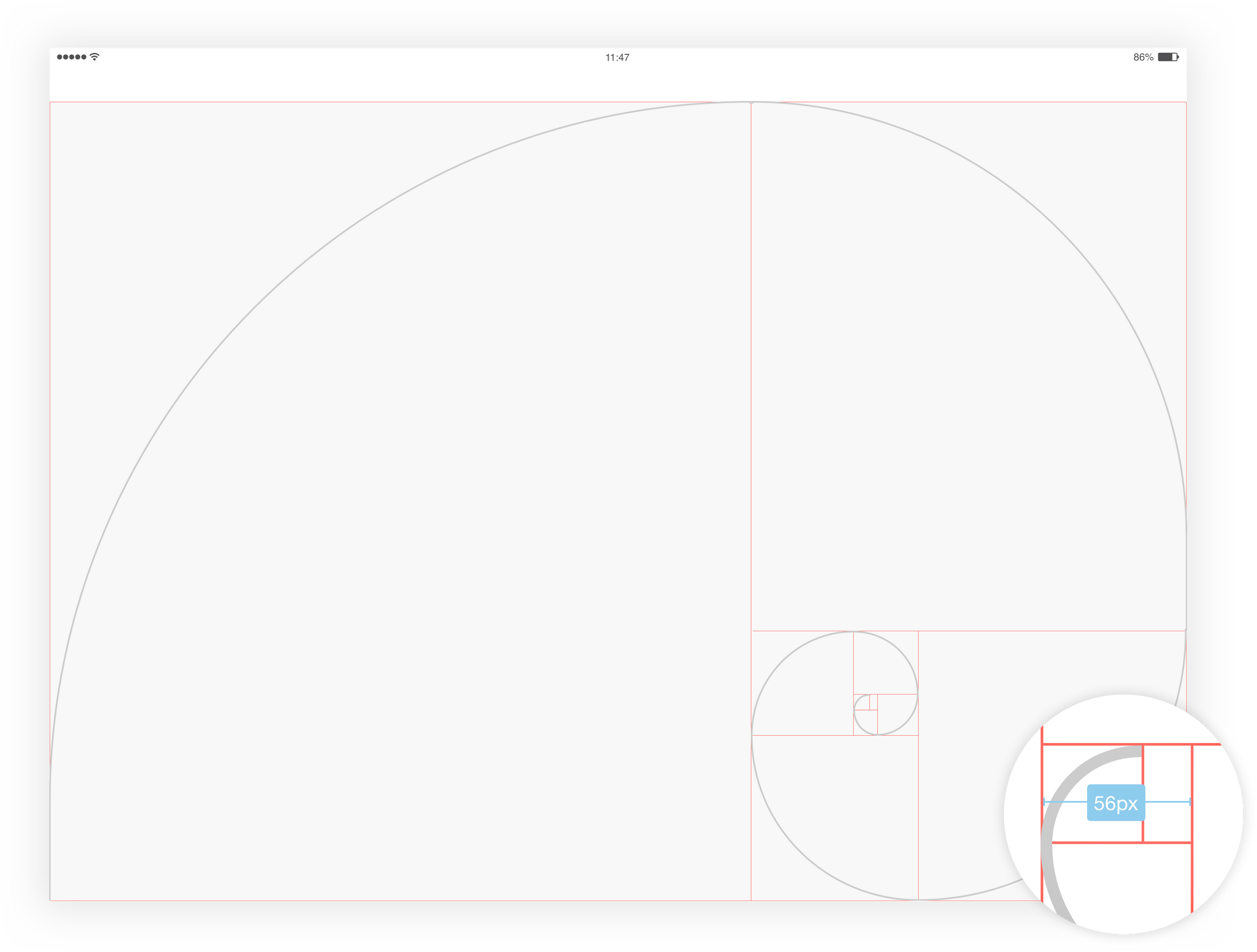
Square One
Cura's Design system follows rules that establish the entire design environment. Every layout, component, & specification is inheriting the Golden Ratio Principle
Golden Ratio Breakdown
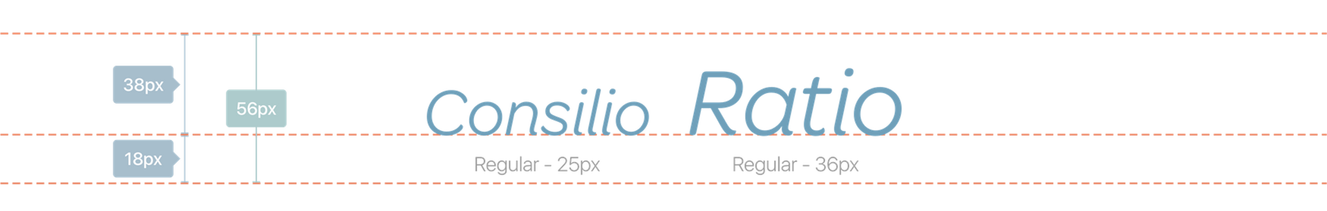
We definied our base typography unit to be modular. We wanted a pleasing proportion between our running text font size leading & corresponding line-height
We took our modular (56x56) & divided it into thirds. We obtained a leading of 38 px. Within that, our running text size at 36 px
Base Spacers
The Base Spacer to move horizontally is 56 px & multiple or fraction of it. All the spacings are based on the Base Spacer

Baseline Deconstruction
The 'BASELINE' is based on the Base Spacer of 56 px. The 'BASELINE' is divided by thirds to create a 2/3 - 1/3 grid
Font Scale Breakdown
The 'Font Scale' is calculated based on the leading 56 px

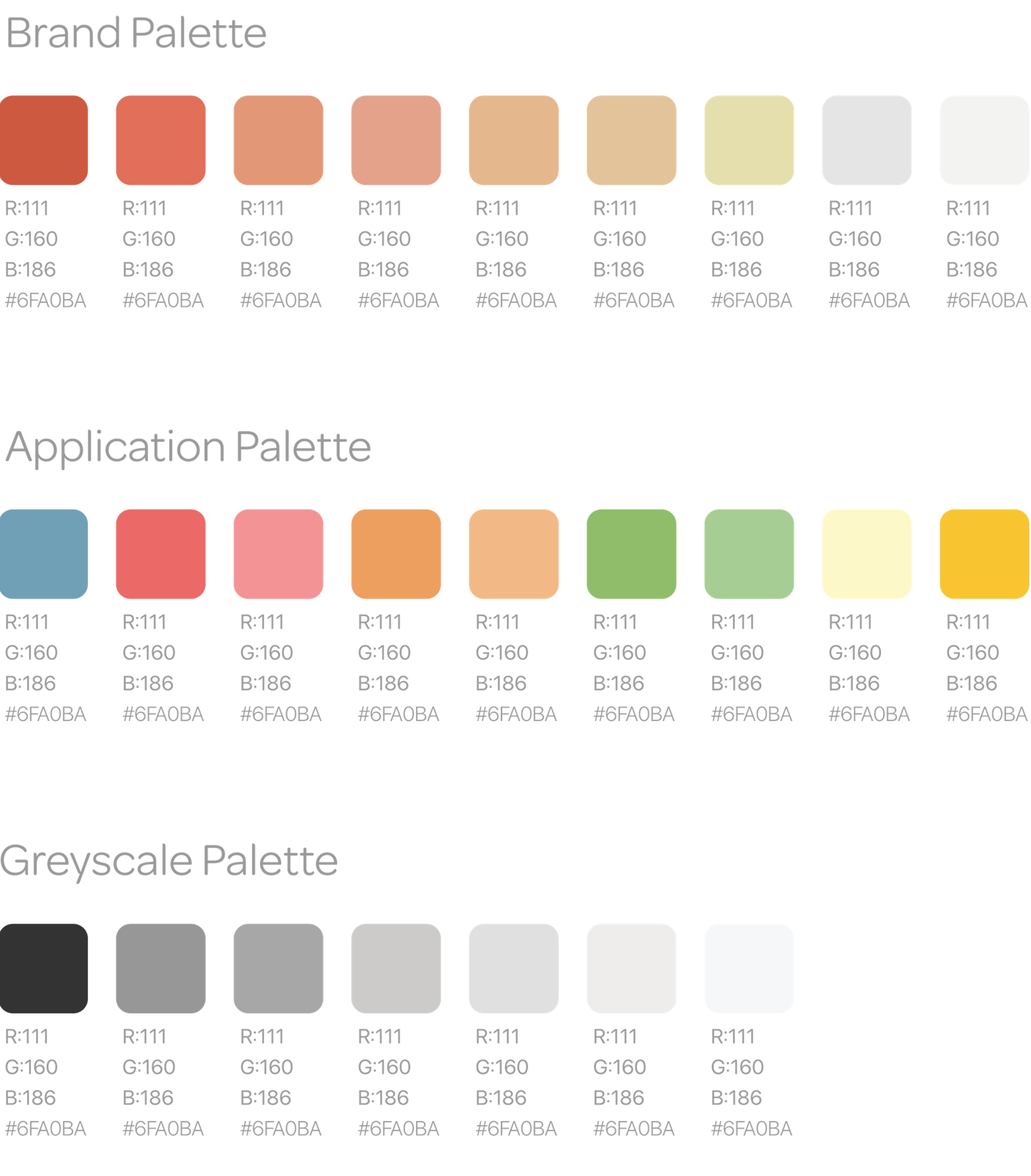
Color Palette
Every color used across Cura's platform has a purpose & follows these criteria:
Modern, Organic, Elegant, Approachable, Scalable
The Usage of the application palette is to display the clickable areas & different states of feedback.Greyscale usage is for neutral/ inactive interface components and running text.
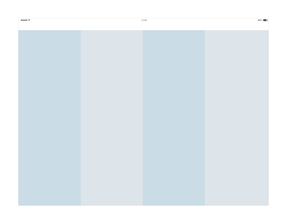
Usable content areas
Cura layouts ease consistency across platforms, environments, & screen sizes by using uniform elements & spacing. The interface uses intuitive & predictable layouts, with consistent UI components & spatial organization. Layputs should use a consistent grid, content's emphasis, & provide negative spaces to punctuate the interface & provide breathing room for thoughts
The application is supported on various devices with different resoltuions (ex. iPad 12.9 inch, 11 inch, 9.7 inch). Even with multiple resolutions, the usable content area carries the same ratio and proportions to keep consistency
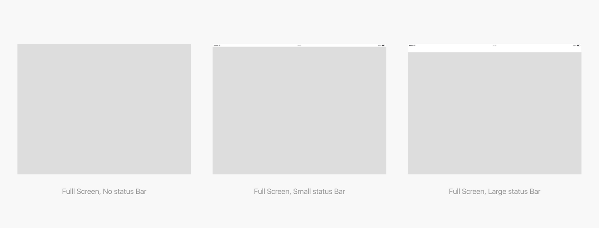
Content area basis/ support
The Full screen space depends on the support used to display the applications. It will follow the resolution of the hardware used
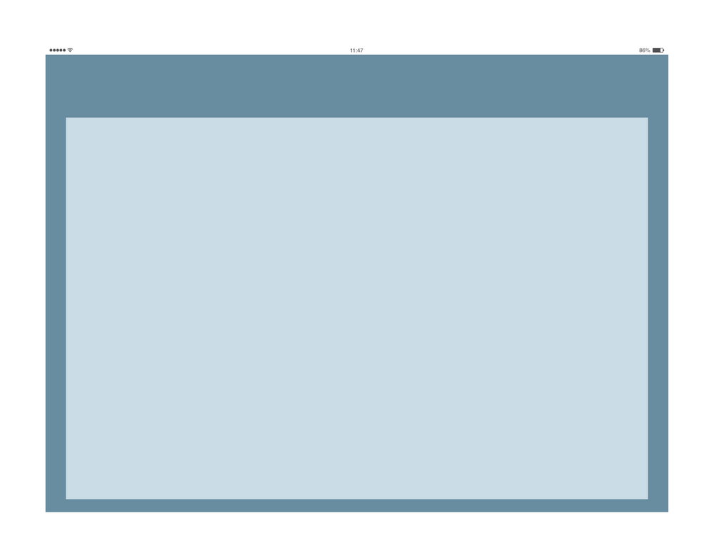
Right Panel - Golden Ratio
The Right Panel Ratio follows the Golden Ratio divison here.
The division was made on a 12.9 inch iPad Pro

Questionnaire
The Questionnaire layout contains an expandable left navigation panle. The content in the feedback area readjusts depending on the left navigation panel status. It is the same behaviour when the right panel is open

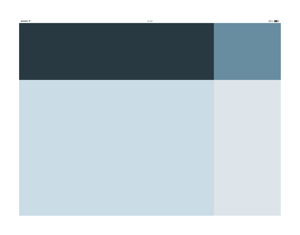
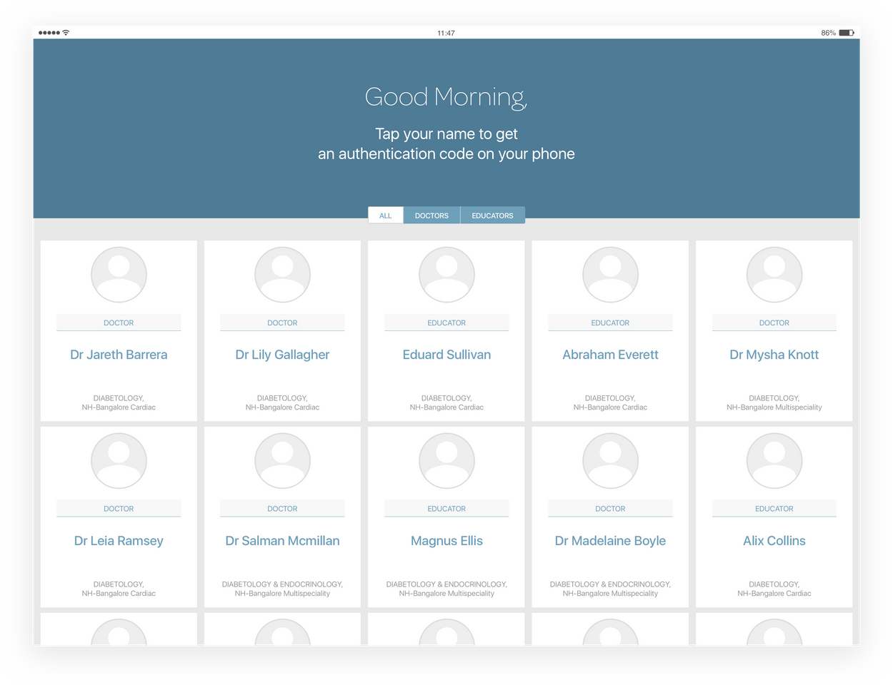
Authentication - 5 Columns
The authentication layout is divided into five columns vertically with a band on top; expanded across the width of the screen
This screen displayes cards for doctors to log in. The height of the cards varies depending on the content it holds
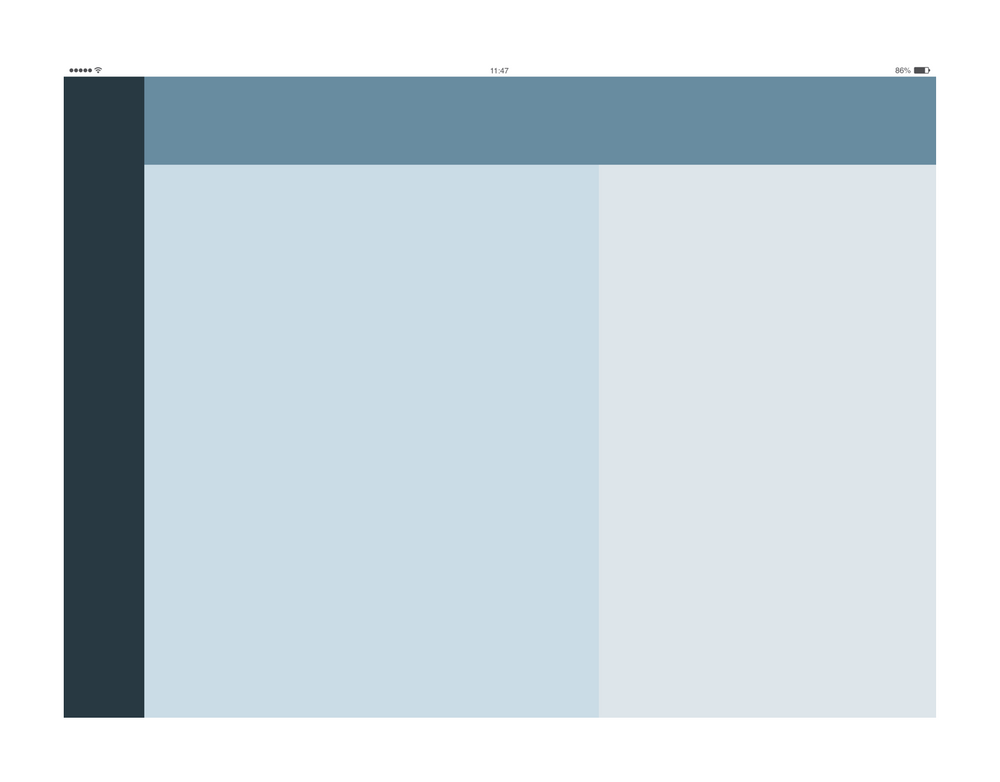
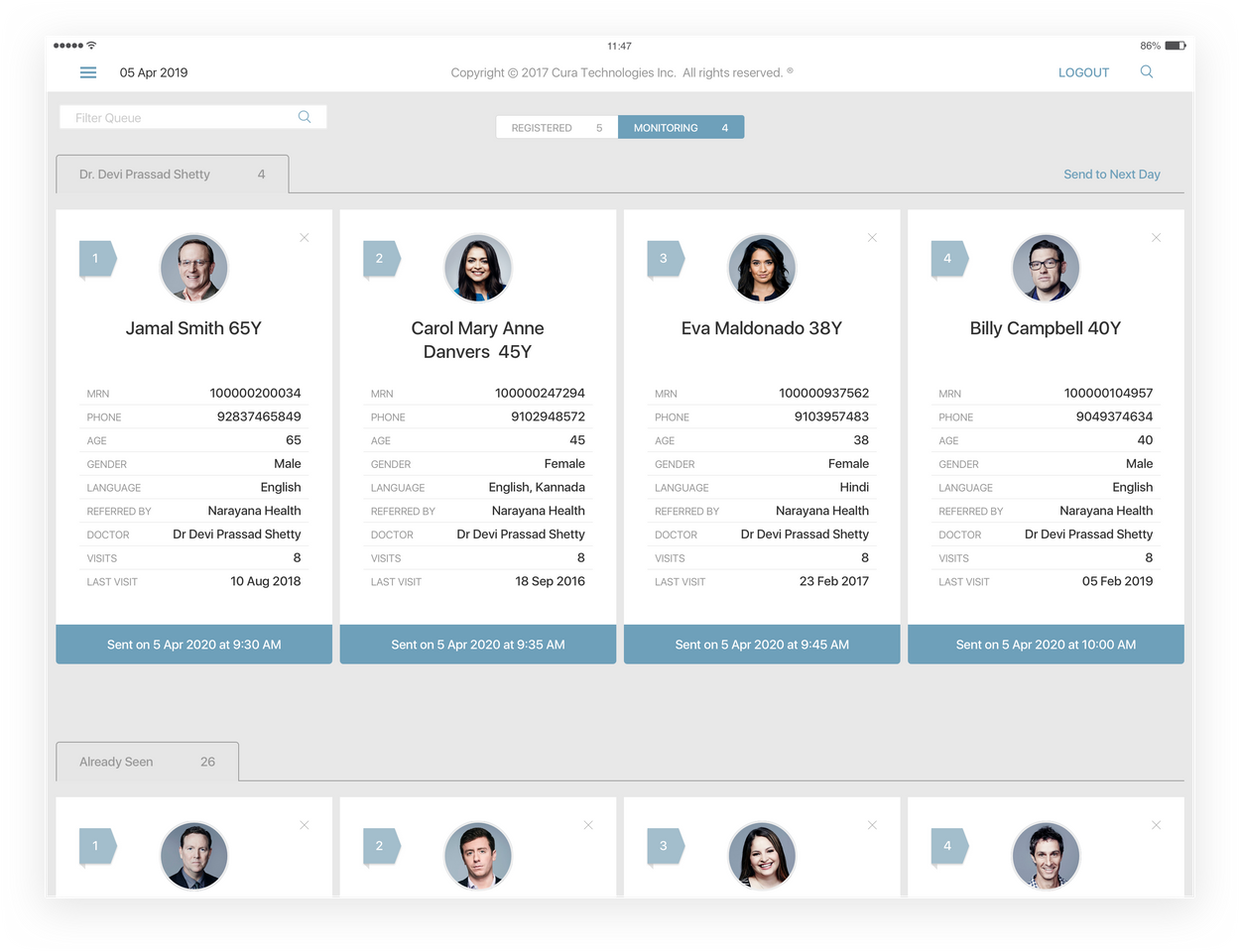
4 Columns
The four columns layout is used for the Dashboard screen & the Queue. The Status bar is bigger to receive information & actions like a 'Back', 'Logout' & 'Search' buttons
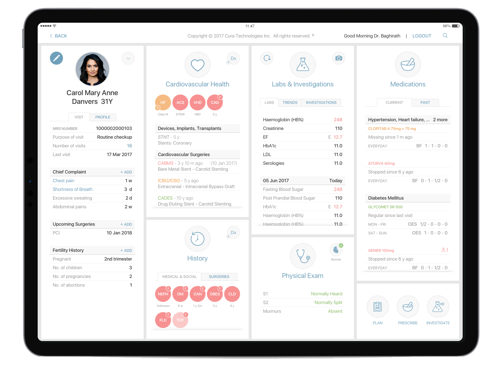
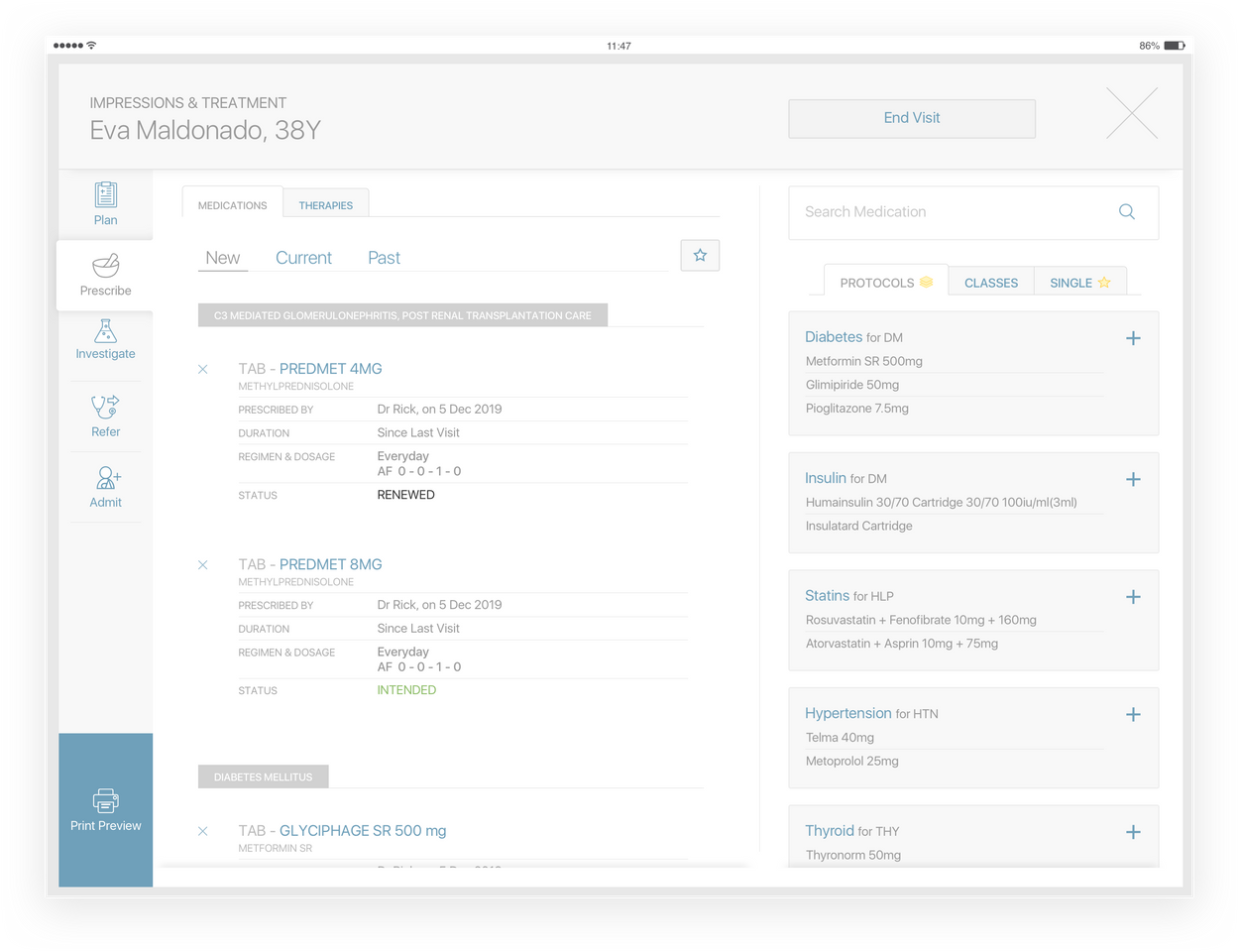
Impression & Treatment
The I&T layout has four different areas. On the left, there is a left navigation panel, which allows us to navigate through different sections. Across all the sections we apply the same main layout
The main area is divided into three parts. The top band is used to display the patient's name & the I&T's global actions. The feedback & editing parts follow the golden ratio principle to divide the rest of the space
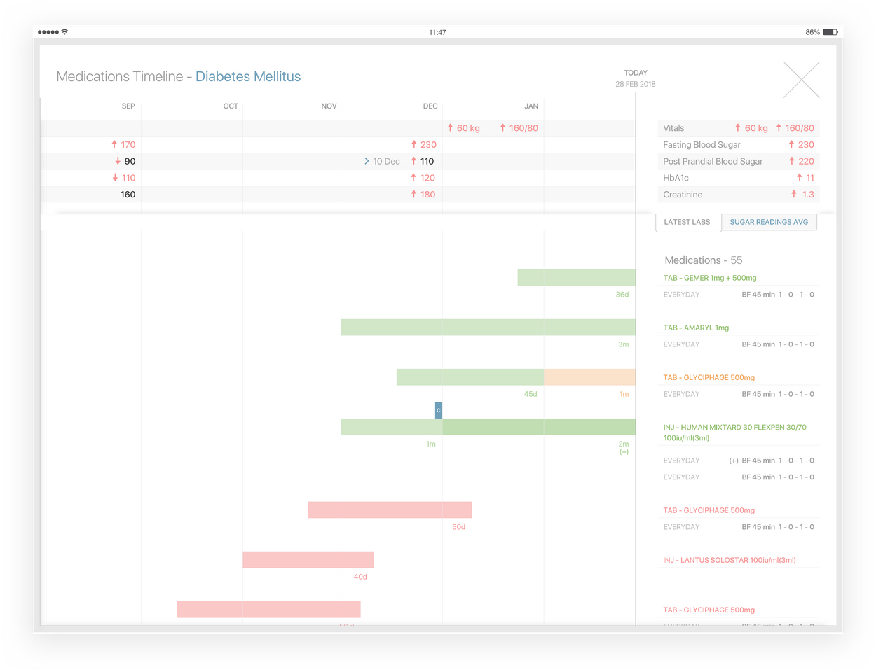
Current Medications - Timeline
This timeline is horizontally divided into two main parts. The top part is eant to display Labs across time. In the bottom portion, we present the details of the medications
The left part of the screen shows the Timeline, which we cn navigate through time. On the right part, we can visualize details of the latest labs & medications
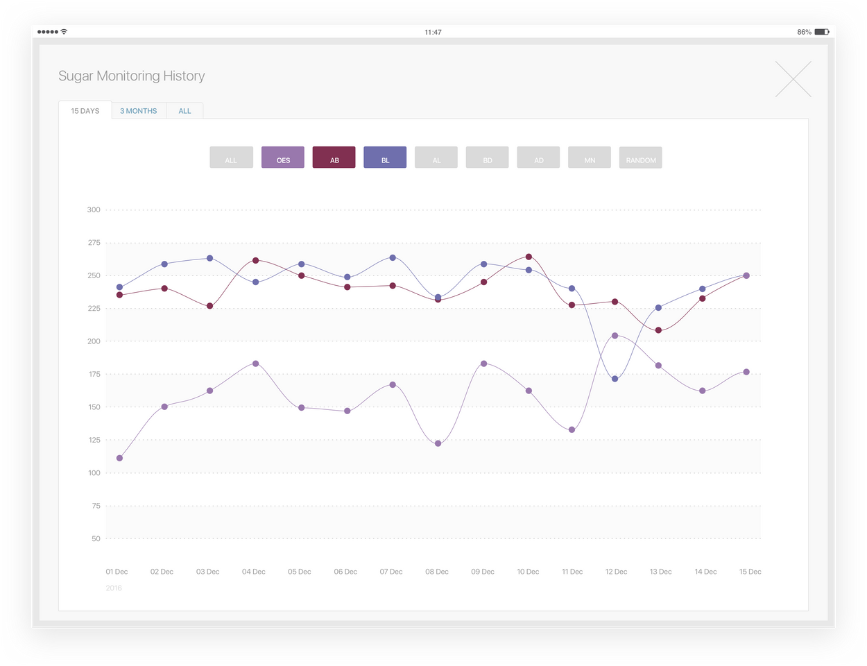
Grpahs - In full screen
The full-screen graph, as the name implies displays two areas. One with the graph & the rest of the screen used to add actions regarding the screen (closing action, navigations through different charts)
Actual Product Representations

Interface Components
Eac Element Follows the Color Palette to create an order of actions in each panel. System icons symbolize navigational elements, common actions, & contion definers to body parts.
With content dense with text, visual representations must simplify & bring a more organic aspect to the interface
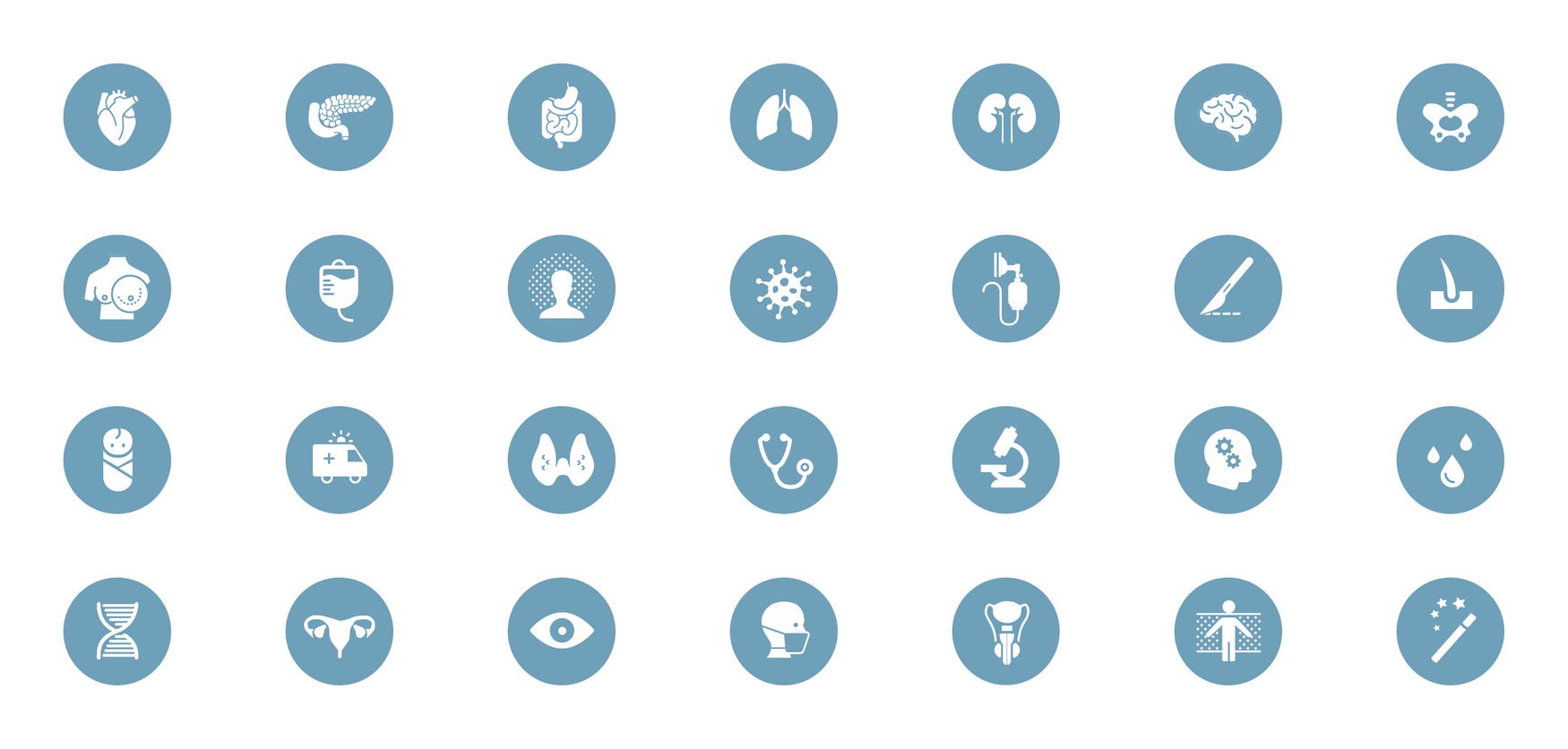
Iconography
Every icon is as simple and yet detailed to recognize organs or medically relevant items/ procedures easily. The set of icons expand extensively to match the requirements of each medical speciality
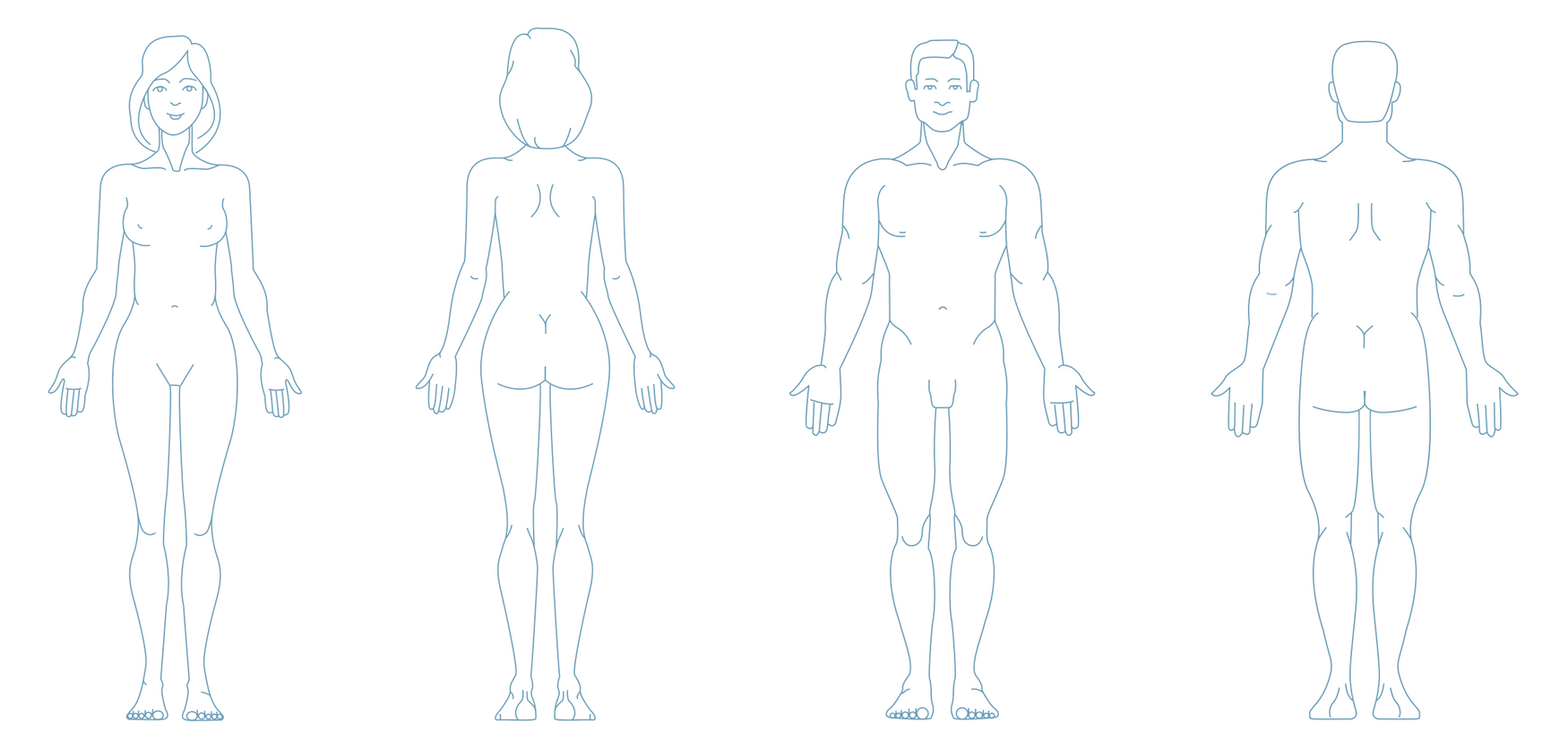
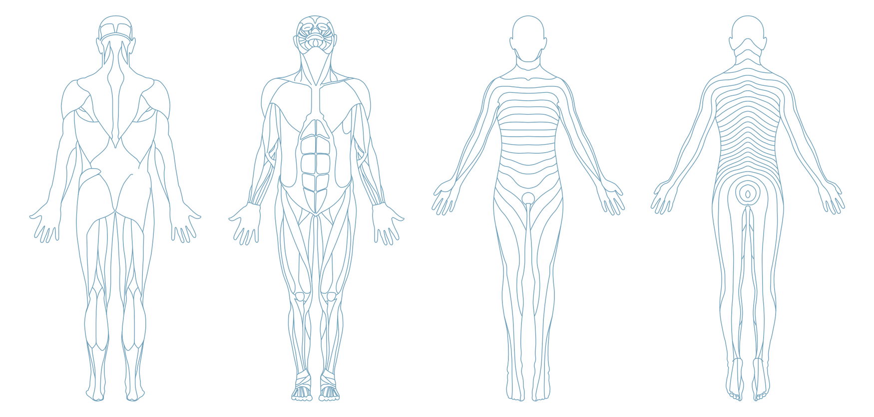
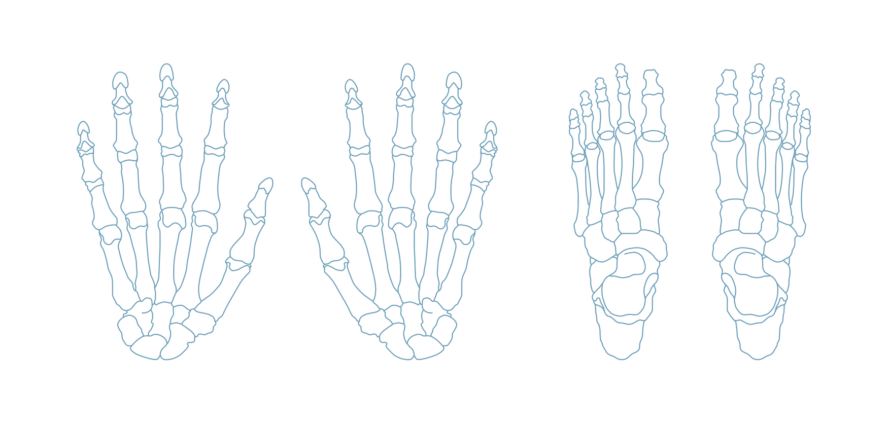
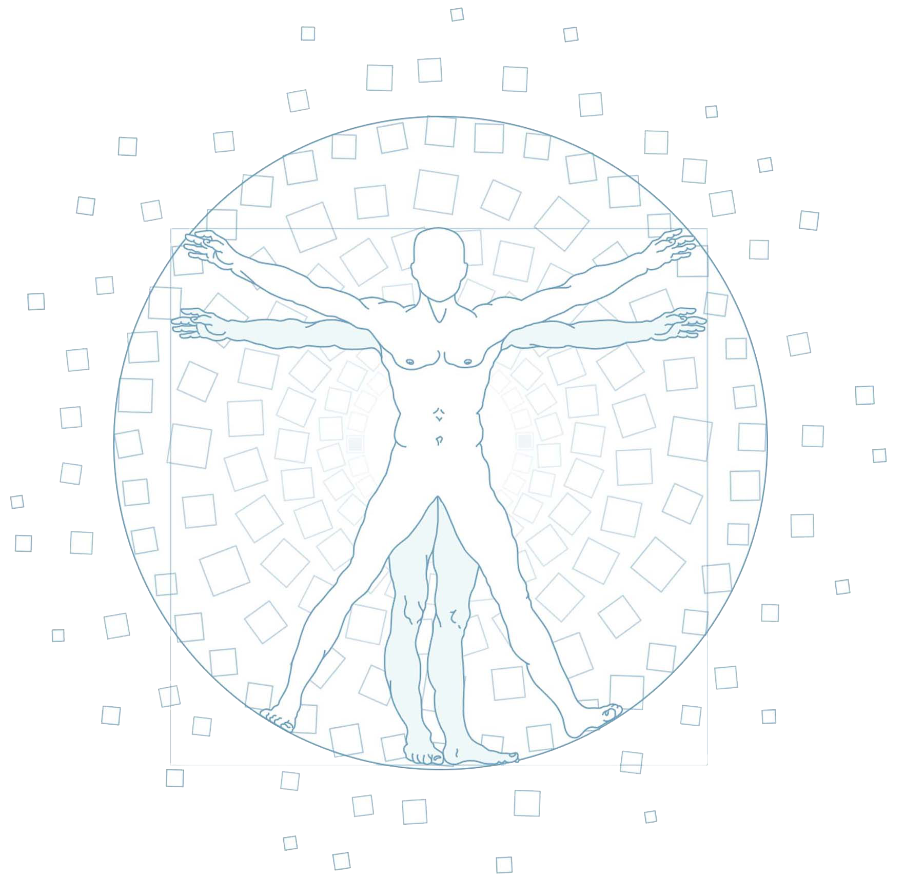
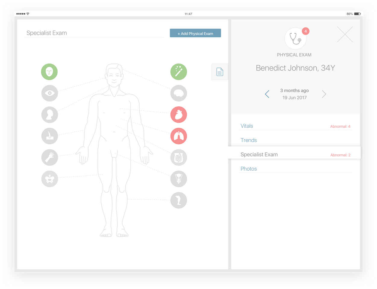
Body Diagrams
The body diagrams are a collection of illustrations to represent every part of the human body (full body, part of body detailed, organs, dermatomes, peripheral systems, etc ). They are used to help the user identify and locate any conditions and body parts more naturally. We integrated them into the flow to bring a sense of reality by representing the patient that the doctor has in front of them & simplify the interactions between them