Reya Healthcare
Platform | Health Tech | Health AI
Product Philosophy
Reya specializes in Wellness & Longevity Clinic software. We build AI systems for Doctors, Care Teams & Patients
"The Mission": Provide intelligent digital tools and comprehensive, human-centric solutions for mind and body wellness, longevity, and healthspan extension
"Human-Centric Software": The Reya team took eight years to study and document digital tools at global specialized healthcare centers. We identified unaddressed problems, created smart solutions and dashboards, and then worked with doctors to beta test thoroughly
Reya is committed to be the product leader in an emerging field of 'Longevity Intelligence': AI-powered augmentation of human lifespans. We imagine this collaboration enabling humans to live longer and healthier lives, with less suffering
My Role
My role was to translate data & Medical knowledge received from doctors into user-friendly healthcare applications for multiple platforms (Tablet, Mobile, & Web). I solely handled all the company's UX and Visual design aspects, from UI, personlaized typography, tehinical/ medical illustrations to developing the complete brand identity.
I was incharge of creating & maintaining a systemic library of our product's assets & components. A vital part of my role was collaborating with developers closely to deliver requirements, documentation, & design specifications
Square One
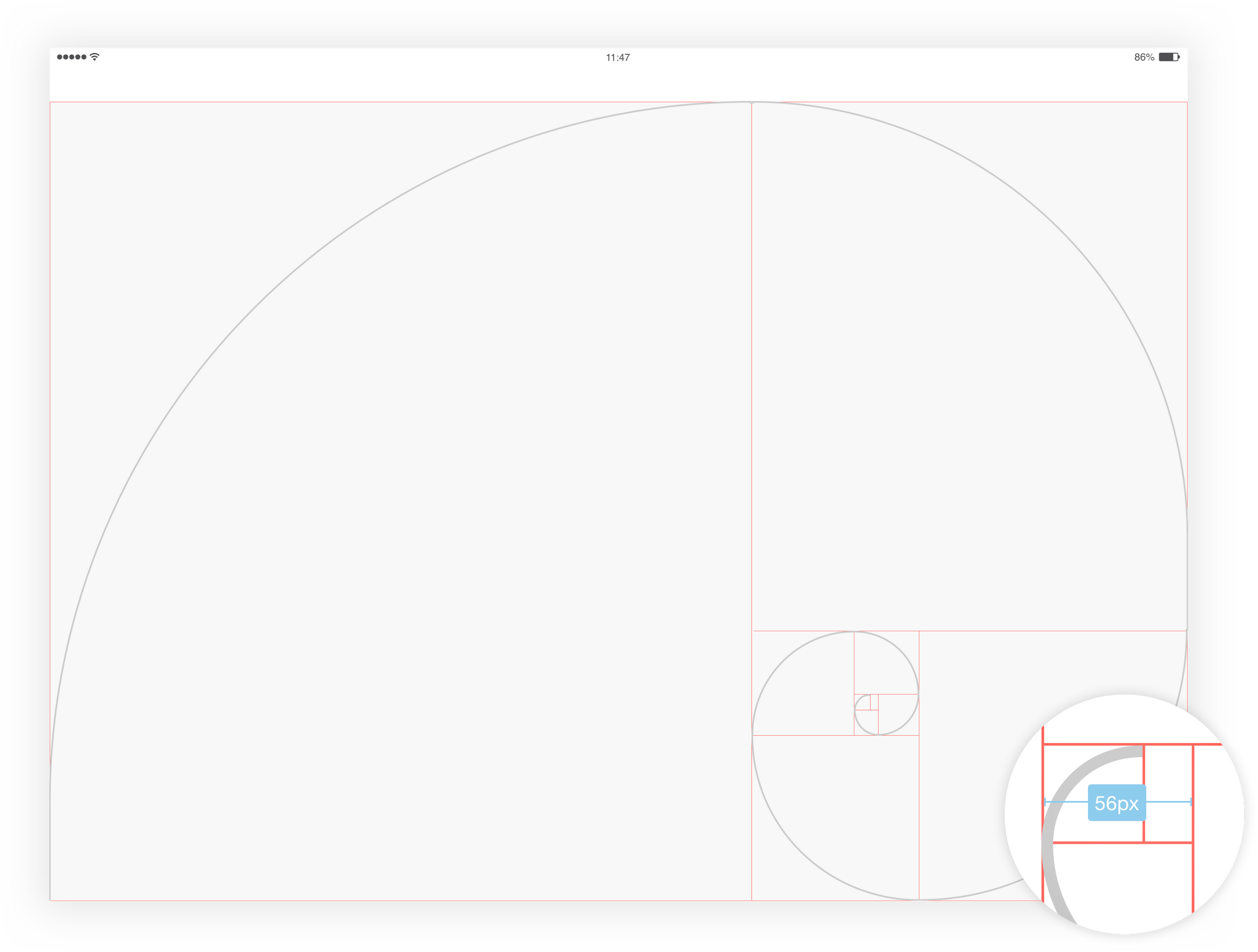
Reya's Design system follows rules that establish the entire design environment. Every layout, component, & specification is inheriting the Golden Ratio Principle
Golden Ratio Breakdown
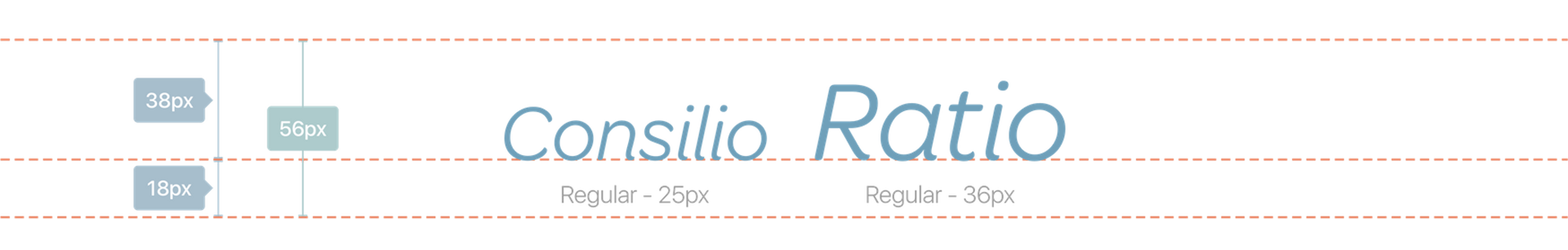
We definied our base typography unit to be modular. We wanted a pleasing proportion between our running text font size leading & corresponding line-height
We took our modular (56x56) & divided it into thirds. We obtained a leading of 38 px. Within that, our running text size at 36 px
Base Spacers
The Base Spacer to move horizontally is 56 px & multiple or fraction of it. All the spacings are based on the Base Spacer

Baseline Deconstruction
The 'BASELINE' is based on the Base Spacer of 56 px. The 'BASELINE' is divided by thirds to create a 2/3 - 1/3 grid
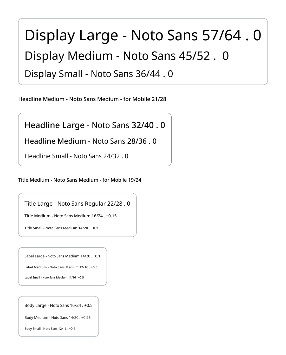
Font Scale Breakdown
The 'Font Scale' is calculated based on the leading 56 px
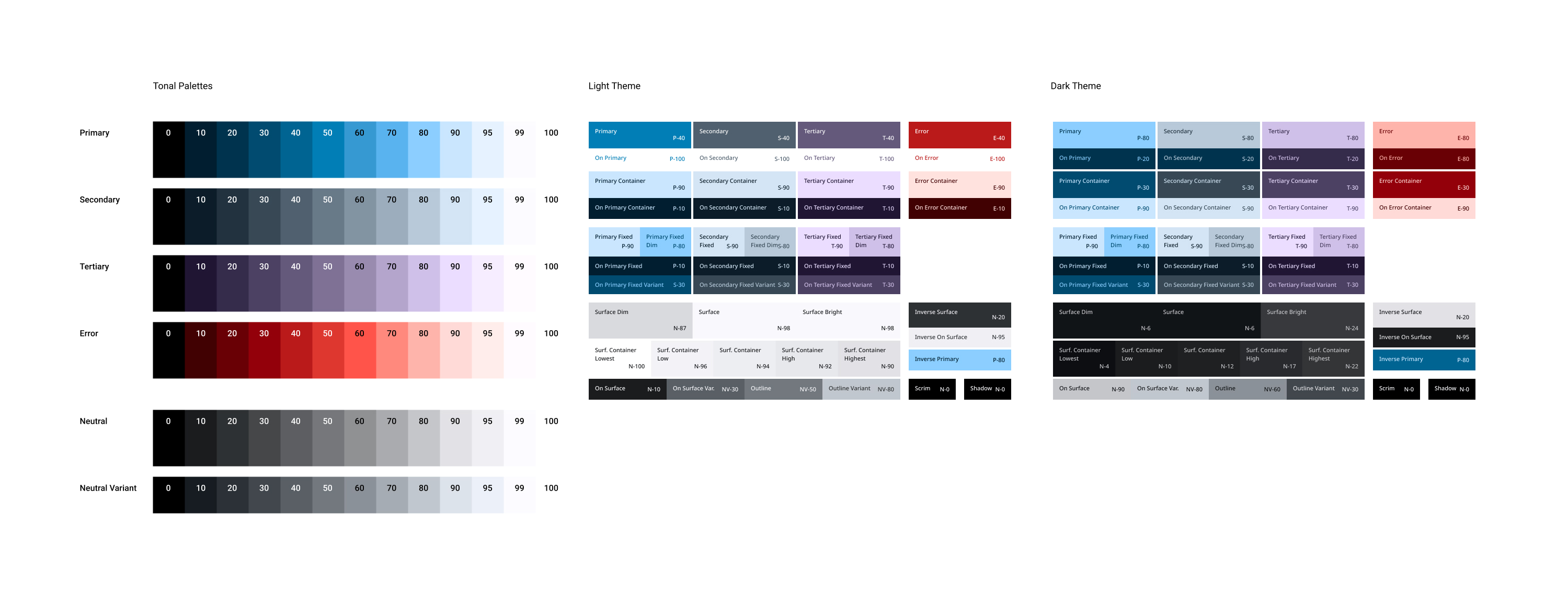
Color Palette
Every color used across Reya's platform has a purpose & follows these criteria:
Modern, Organic, Elegant, Approachable, Scalable
The Usage of the application palette is to display the clickable areas & different states of feedback.Greyscale usage is for neutral/ inactive interface components and running text.
Usable content areas
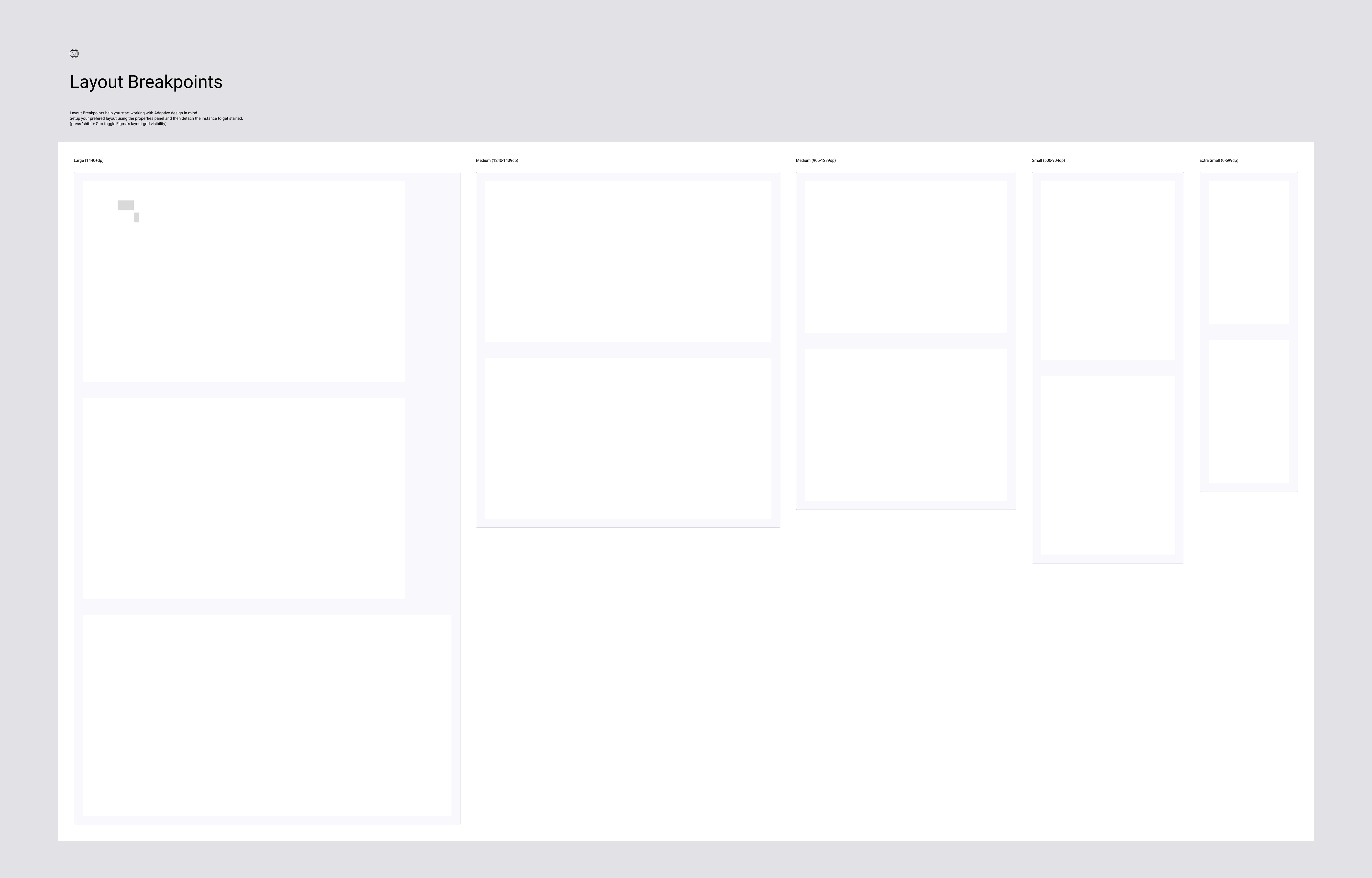
Reya layouts ease consistency across platforms, environments, & screen sizes by using uniform elements & spacing. The interface uses intuitive & predictable layouts, with consistent UI components & spatial organization. Layputs should use a consistent grid, content's emphasis, & provide negative spaces to punctuate the interface & provide breathing room for thoughts
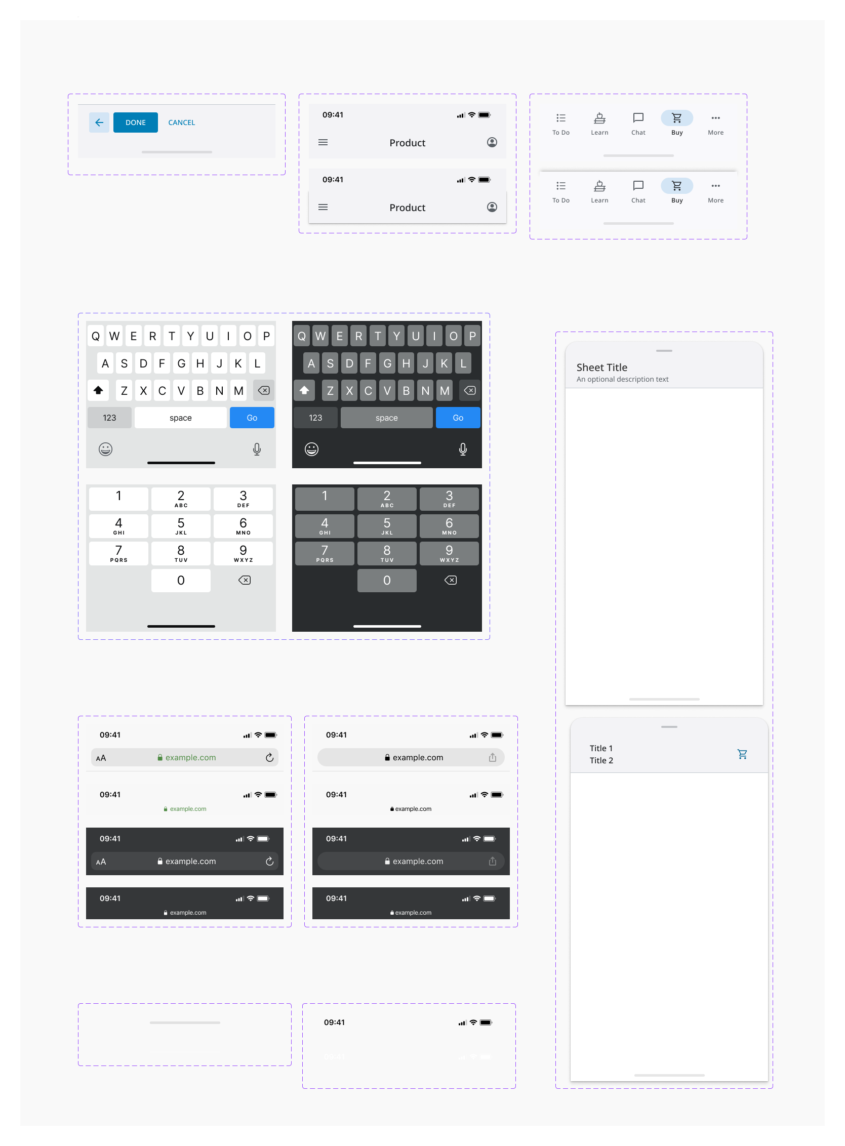
The application is supported on various devices with different resoltuions (ex. iPad 12.9 inch, 11 inch, 9.7 inch, Mobile, & Web). Even with multiple resolutions, the usable content area carries the same ratio and proportions to keep consistency
Content area basis/ support
The Full screen space depends on the support used to display the applications. It will follow the resolution of the hardware used
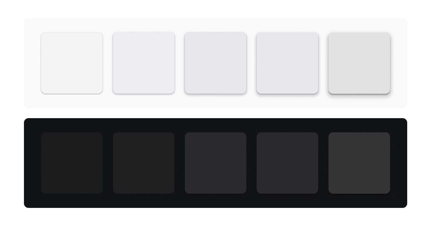
Elevations
Elevation can be depicted using shadows or other visual cues, such as surface fills or opacities
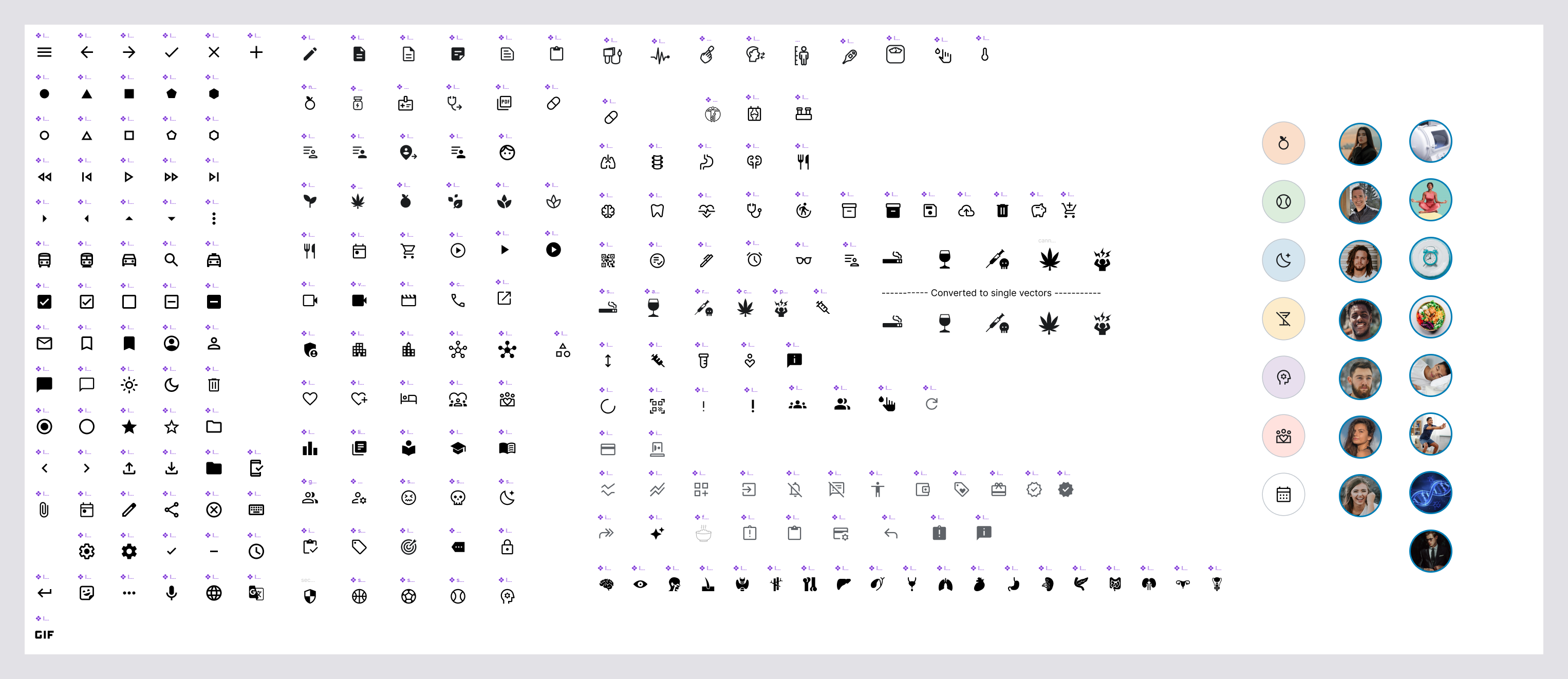
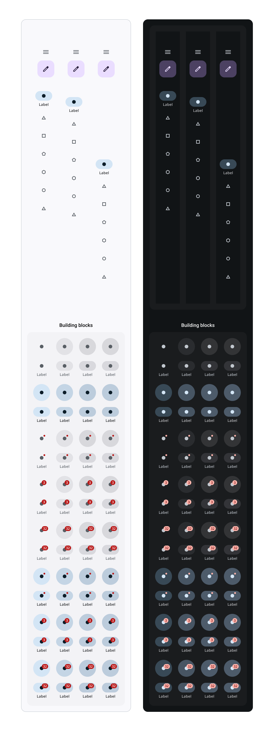
Elements
Construction elements for kit components
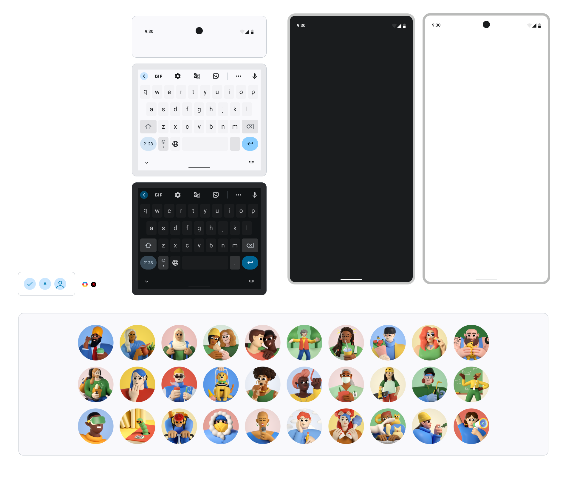
Custom Icon & AvatarsLibrary
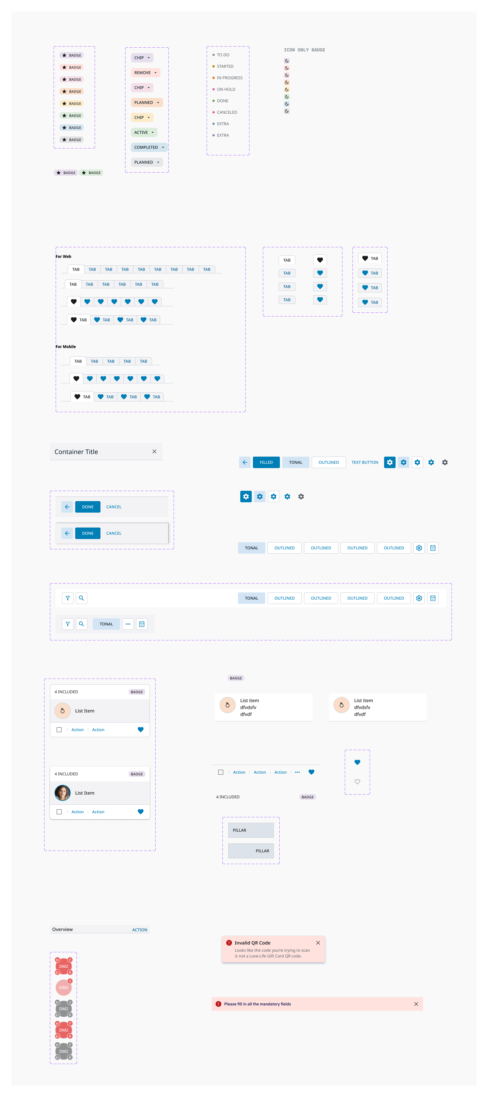
Badges
Bottom app bars
Bottom app bars display navigation and key actions at the bottom of a screen.
Bottom sheets
Bottom sheets are surfaces containing supplementary content, anchored to the bottom of the screen

Buttons
Buttons help people take actions, such as sending an email, sharing a document, or liking a comment

Cards
Cards are versatile containers, holding anything from images to headlines, supporting text, buttons, lists, and other components

Chips
Chips help people enter information, make selections, filter content, or trigger actions.

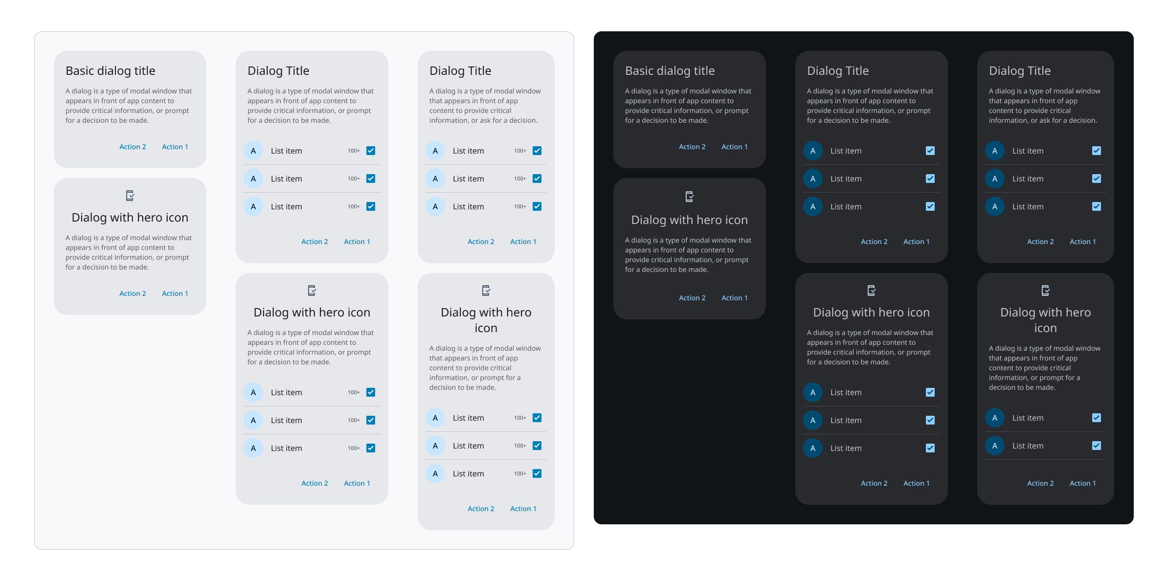
Dialogs
Dialogs provide important prompts in a user flow. They can require an action, communicate information for making decisions, or help users accomplish a focused task
Floating action buttons (FAB)
FABs help people take primary actions. They are used to represent the most important action on a screen

Dividers
A divider is a thin line used to group content in lists and layouts

Icon button
Icon buttons help people take supplementary actions with a single tap

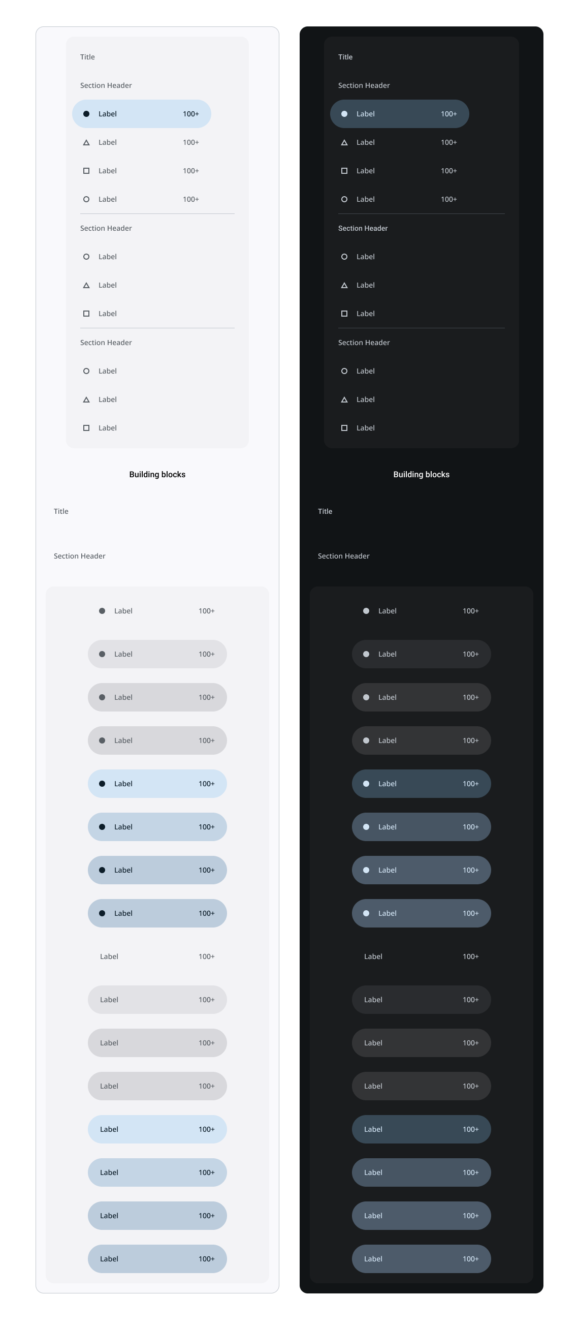
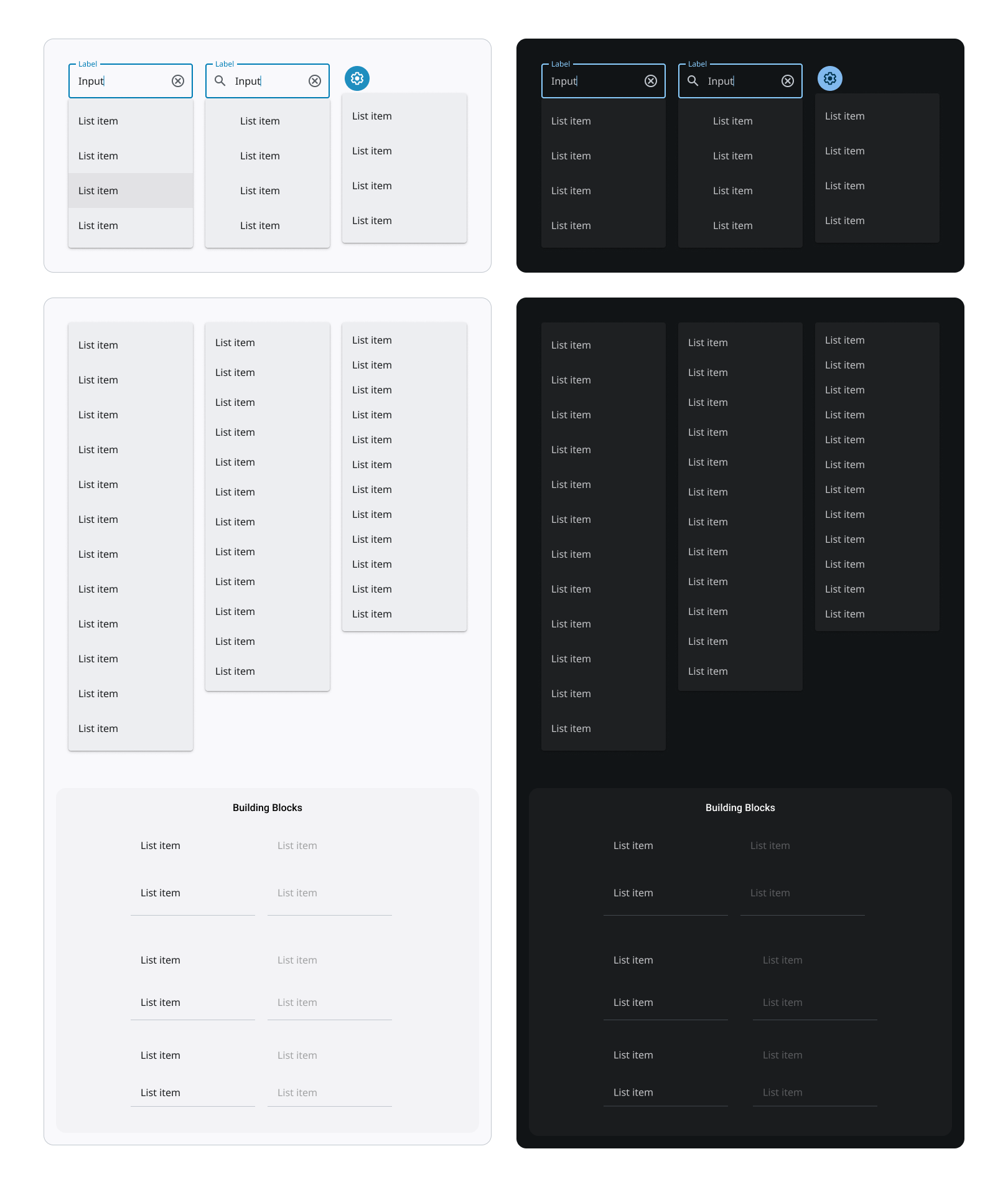
Lists
Lists are continuous, vertical indexes of text and images

Navigation bars
Navigation bars offer a persistent, convenient way to switch between primary destinations in an app. 3-5 destinations is the recommended range

Navigation drawer
Navigation drawers provide access to destinations in your app
Navigation rail
Navigation rails provide access to primary destinations in your app, particularly in tablet and desktop screens
Progress indicators
Progress indicators inform users about the status of ongoing processes, such as loading an app, submitting a form, or saving updates. They communicate an applications state and indicate available actions, such as whether users can navigate away from the current screen

Segmented button: outlined
Segmented buttons help people select options, switch views, and sort elements

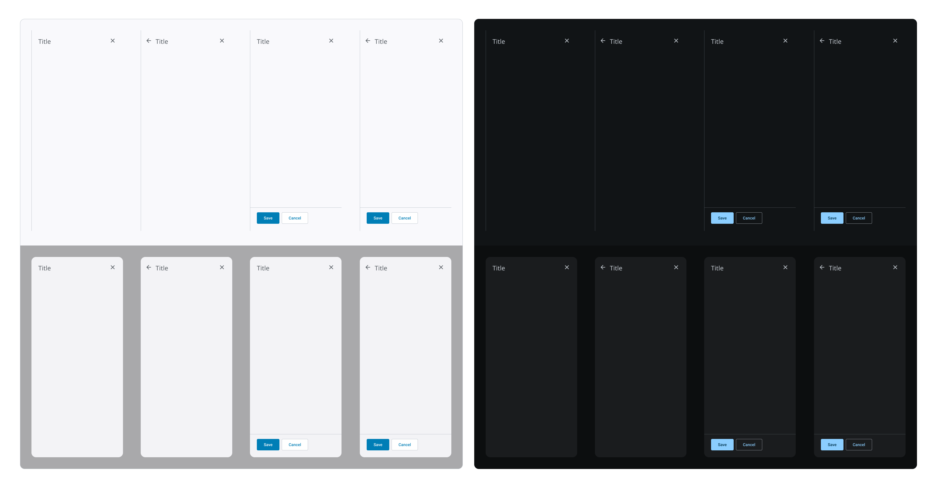
Side sheets
Side sheets are surfaces containing supplementary content or actions to support tasks as part of a flow. They are typically anchored on the right edge of larger screens like tablets and desktops
Sliders
Sliders allow users to make selections from a range of values

Snackbars
Snackbars provide brief messages about app processes at the bottom of the screen

Tabs
Tabs organize and support navigation between groups of related content at the same level of hierarchy

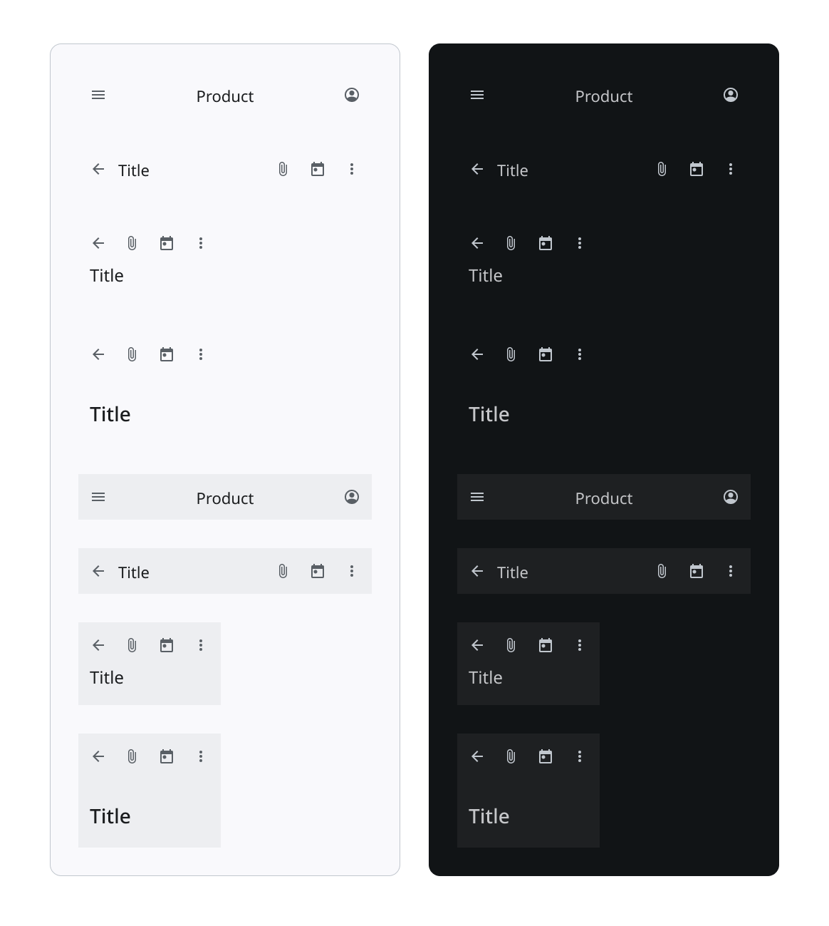
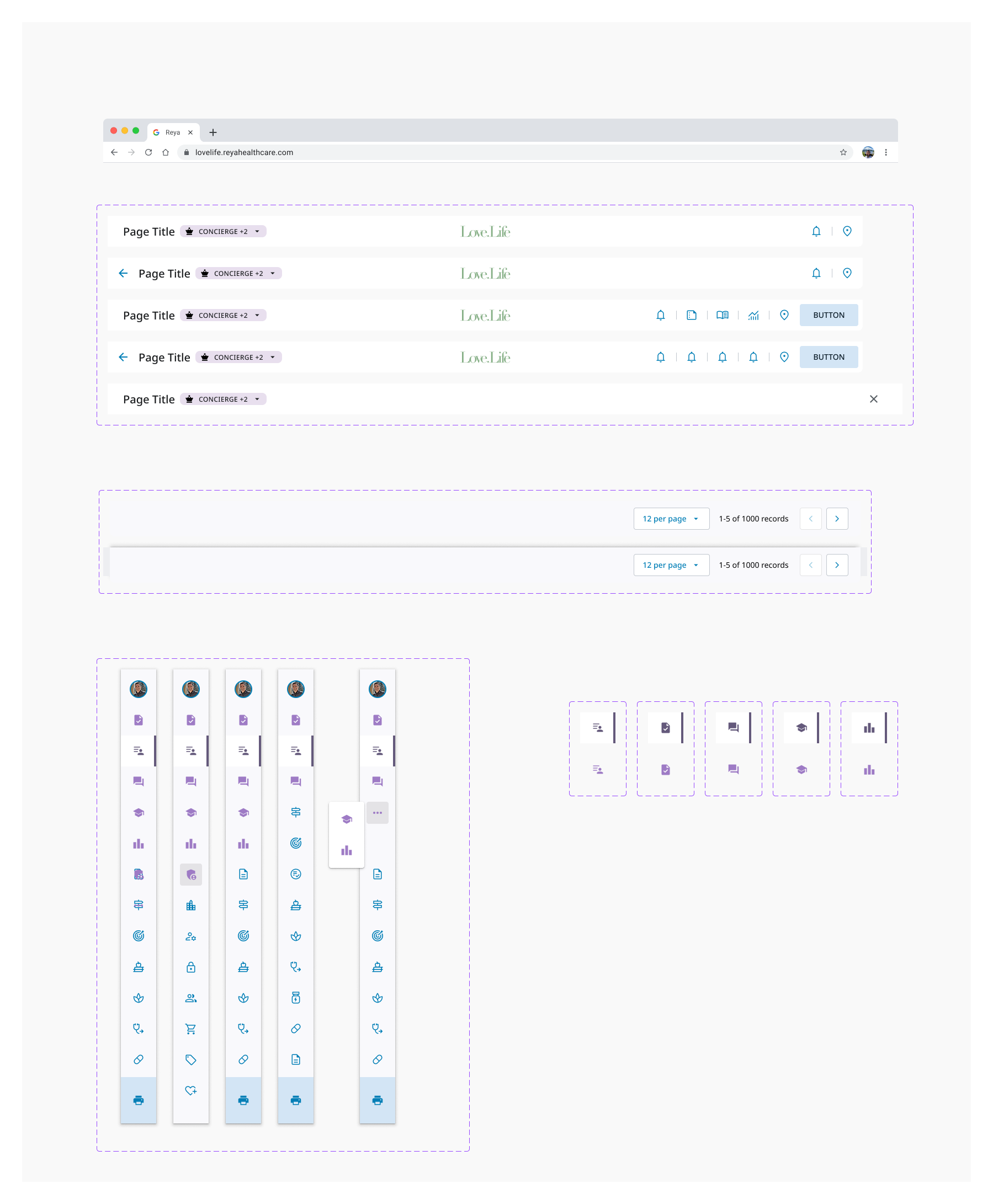
Top App Bars
Top app bars display information and actions at the top of a screen, such as the page title and shortcuts to actions
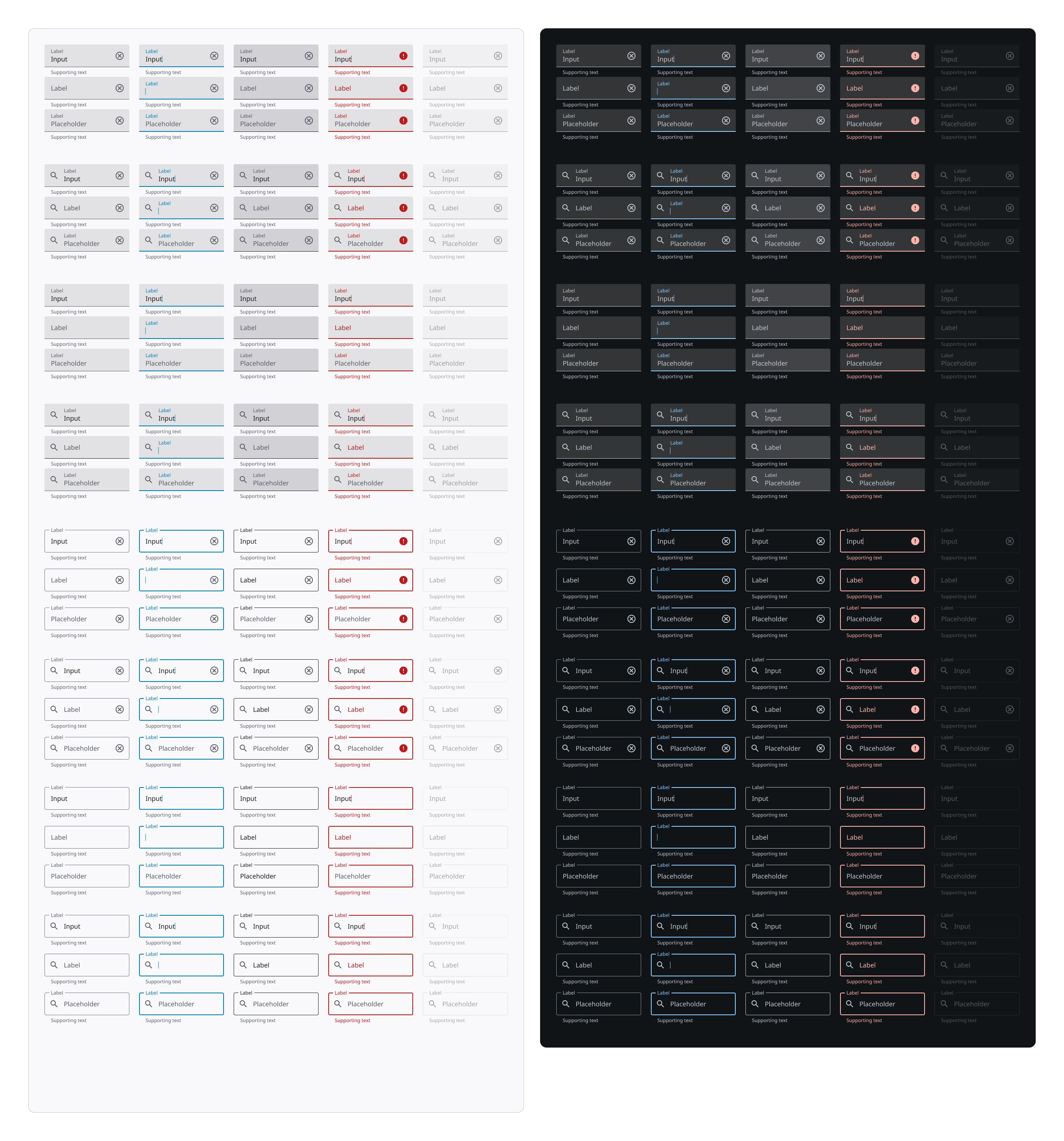
Text Fields
Text fields allow users to enter text into a UI. They typically appear in forms and dialogs
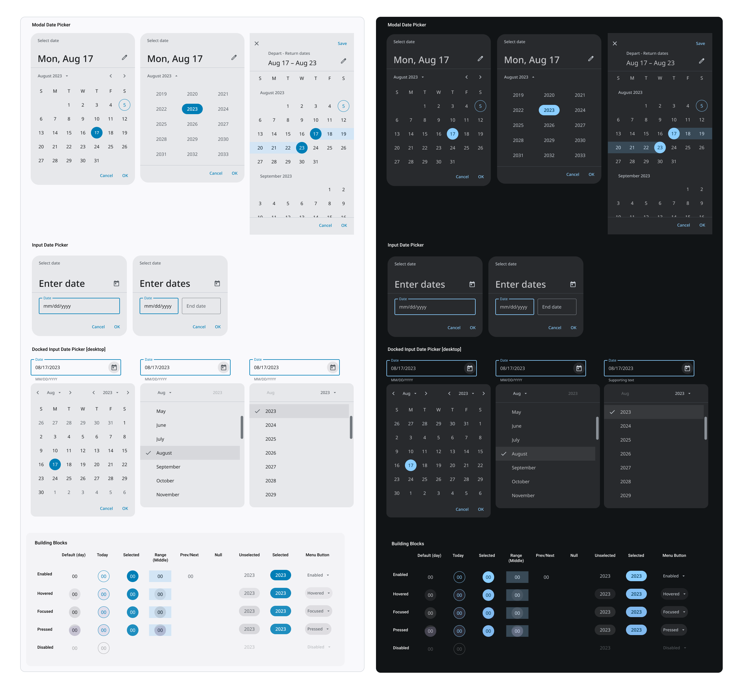
Date pickers
Date pickers let users select a date, or a range of dates
Time picker
Time pickers help users select and set a specific time

Menus
Menus display a list of choices on a temporary surface. They appear when users interact with a button, action, or other control. For Android the target minimum is always 48dp minimum.
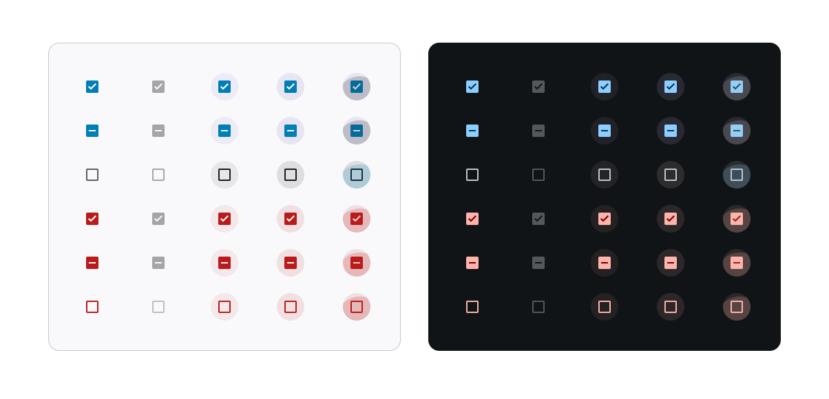
Checkboxes
Checkboxes allow users to select one or more items from a set and can be used to turn an option on or off. They are a kind of selection control that helps users make a choice from a set of options.
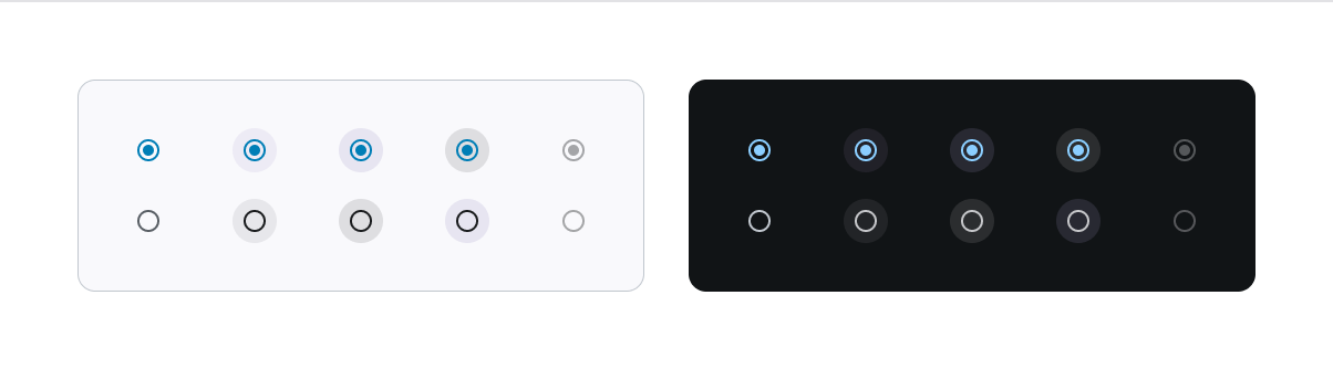
Radio buttons
Radio buttons allow users to select one option from a set. They are a selection control that often appears when users are asked to make decisions or select a choice from options
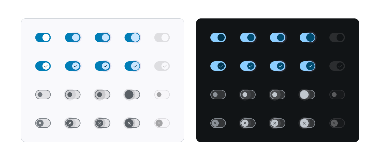
Switch
Switches toggle the state of a single item on or off
Search
Search allows users to enter a keyword or phrase and get relevant information. It is an alternative to other forms of navigation

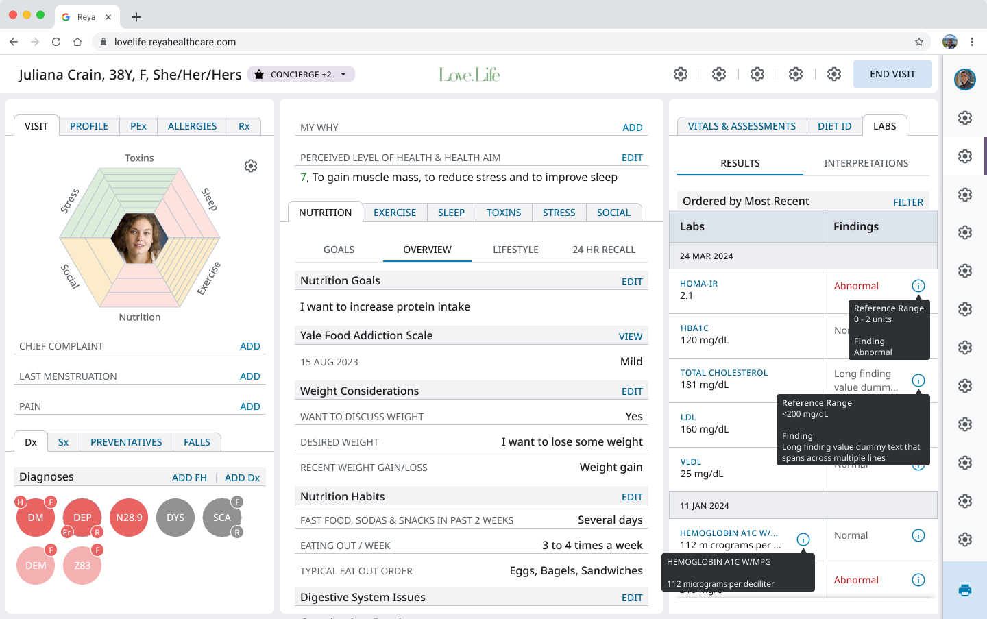
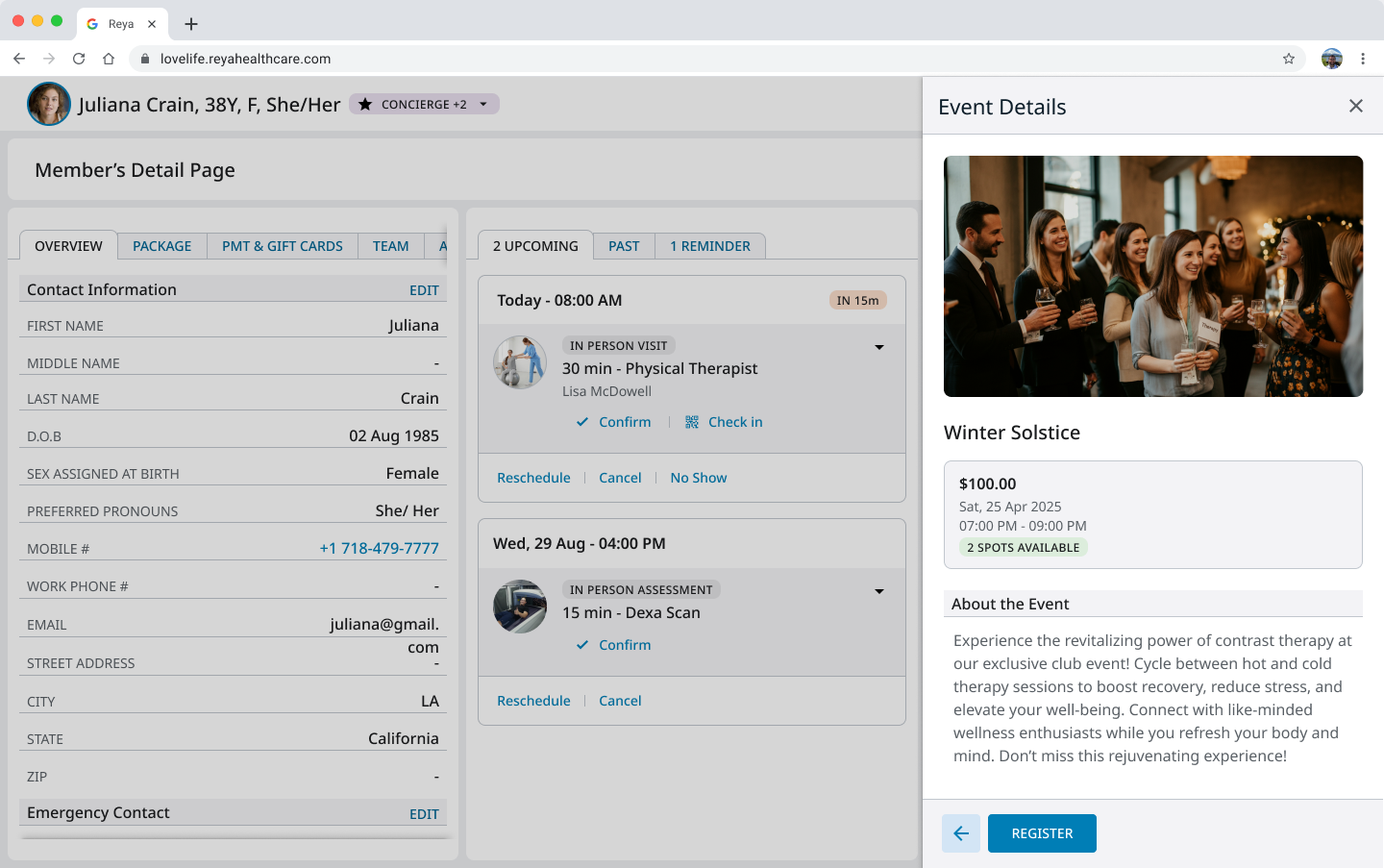
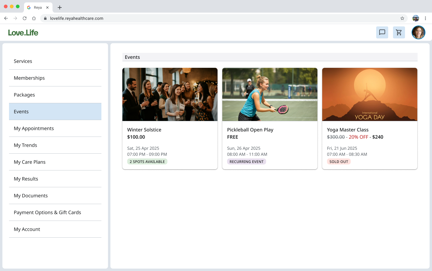
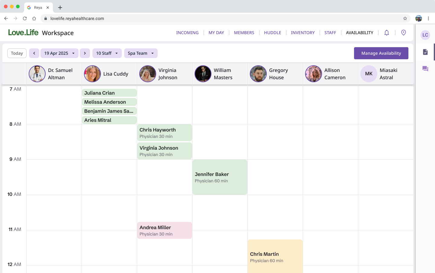
Custom Web Components
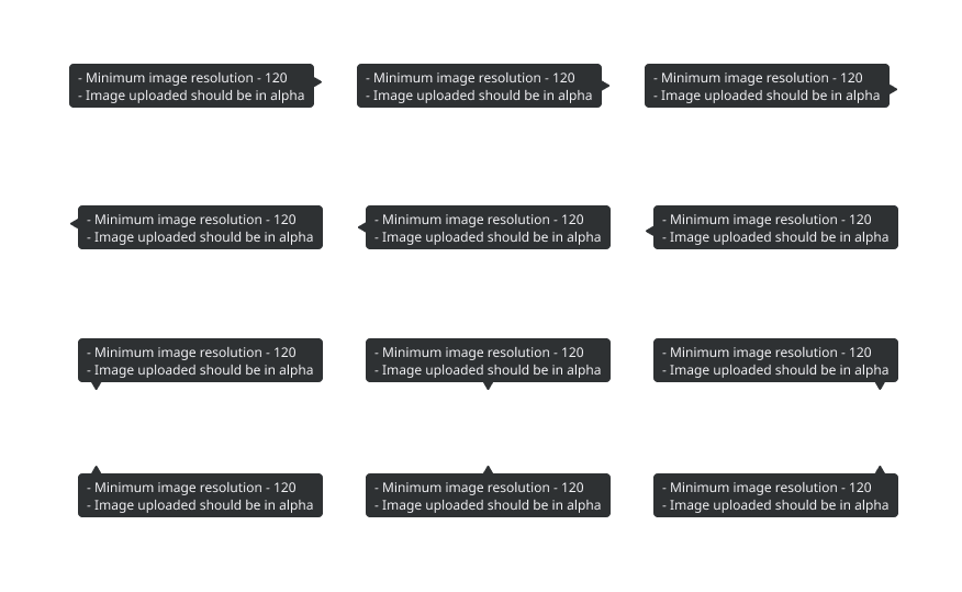
Custom Tool Tip Variations
Custom Mobile Components
Custom Shared Components
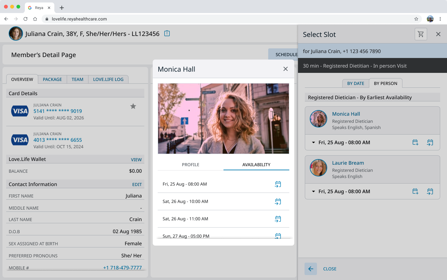
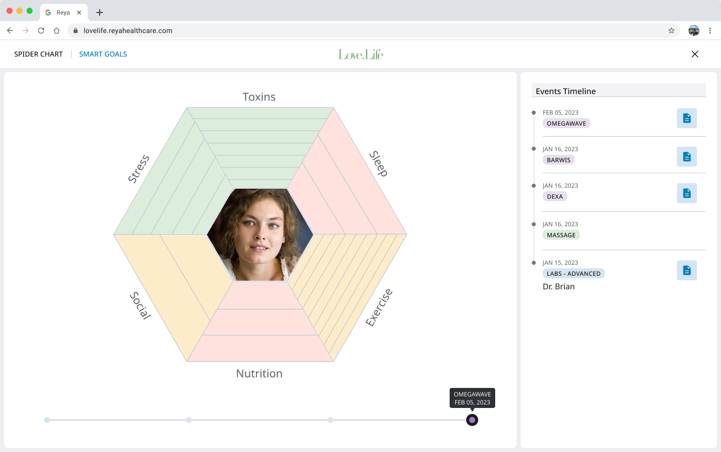
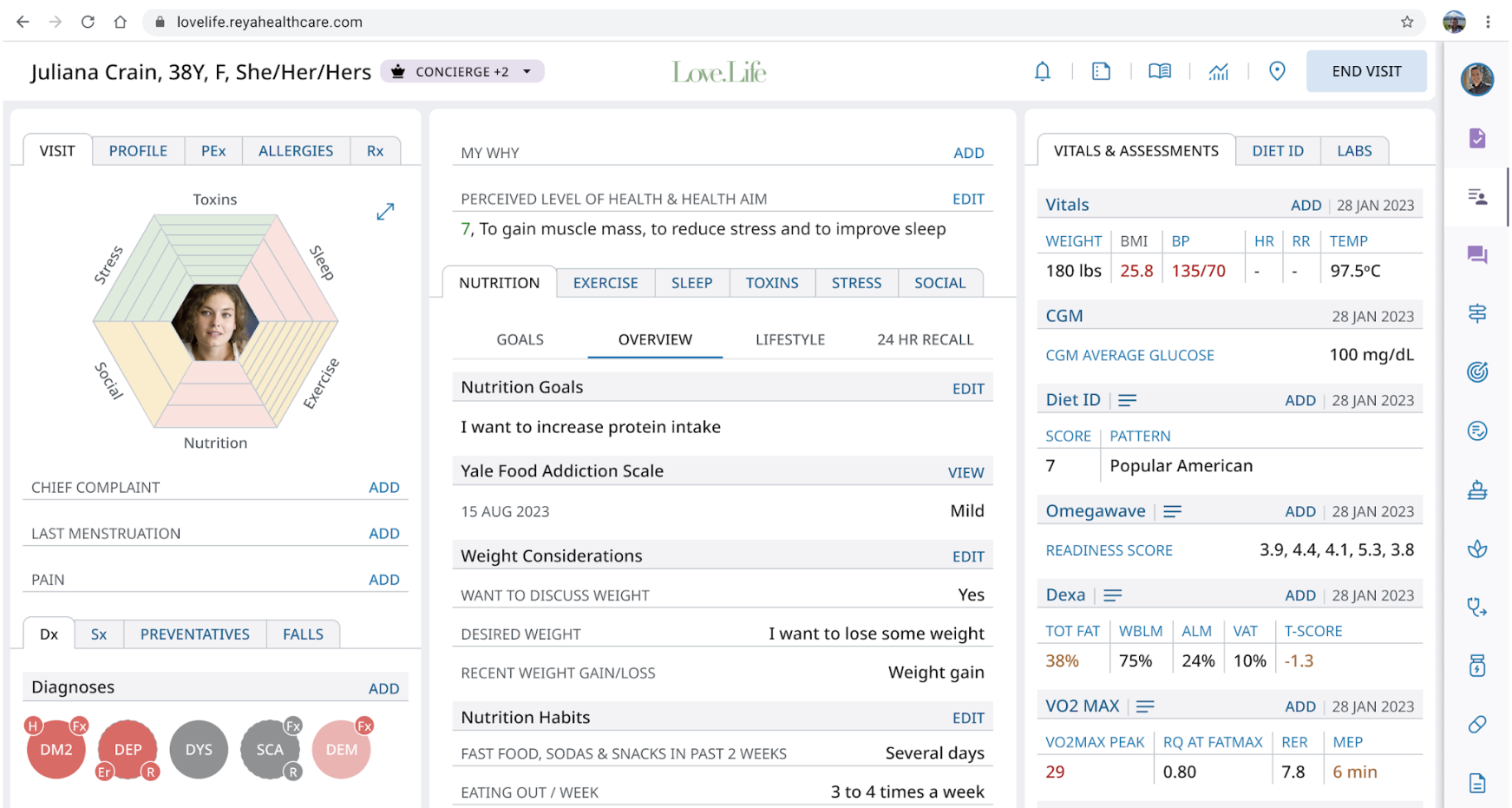
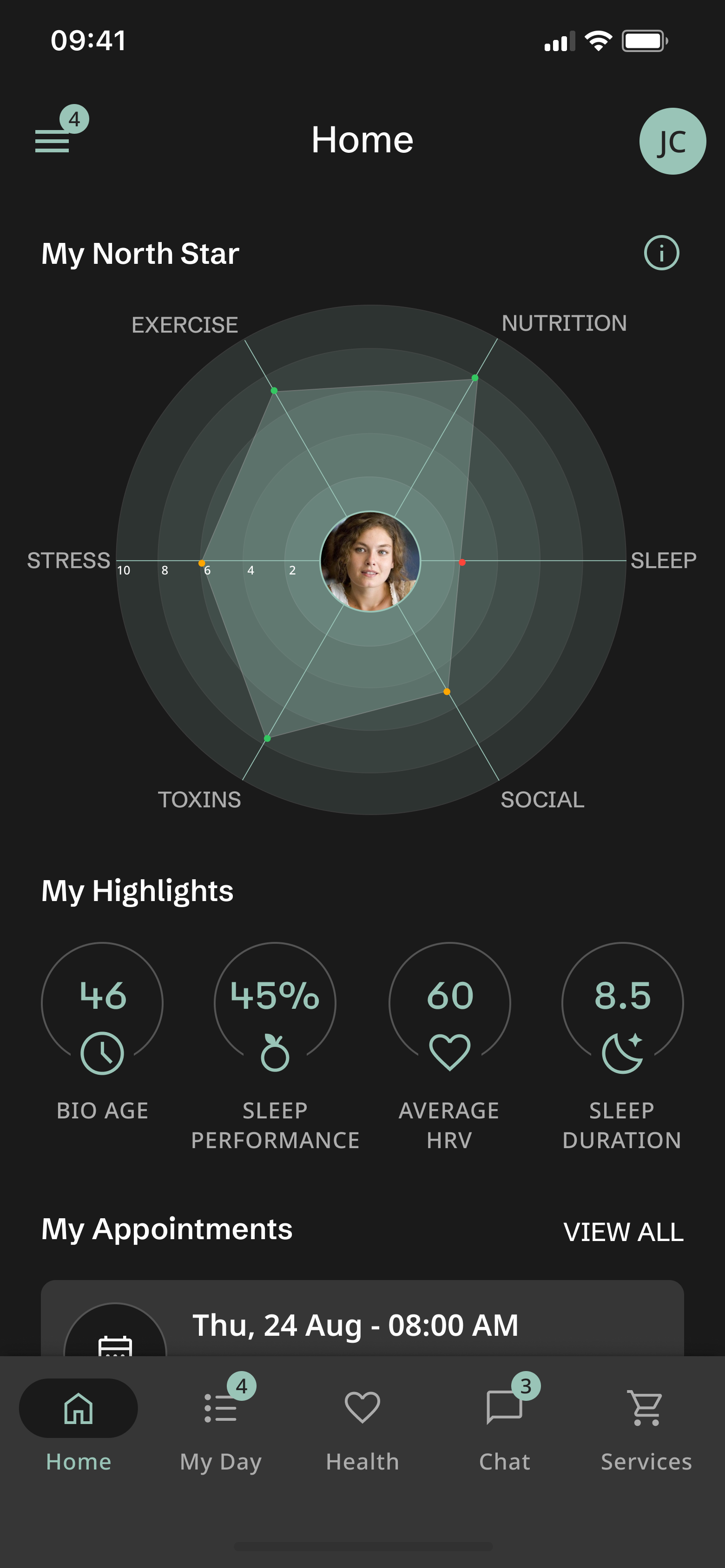
Product Examples
Mobile | Web | Device Specific