Institute For Healthier Living
Identity | Branding | Outreach
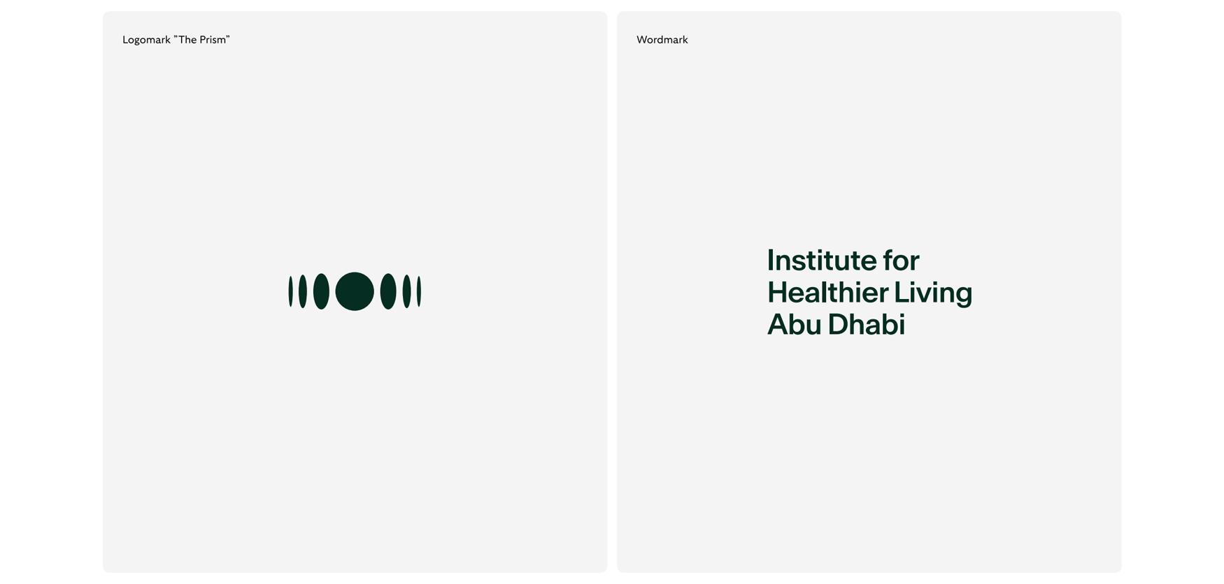
The Brandmark
IHL's brandmark is made up by the union of the logomark and wordmarkM
The logomark is also the basis for our more extensive graphical brand systemM
The wordmark is the unique way that we display our brand's name and exists in both latin and arabic version.
My Role
My role was to solely handle all the company's UX and Visual design aspects, from UI, personlaized typography, tehinical/ medical illustrations to developing the complete brand identity.
I was incharge of creating & maintaining a systemic library of our product's assets & components. A vital part of my role was collaborating with developers closely to deliver requirements, documentation, & design specifications
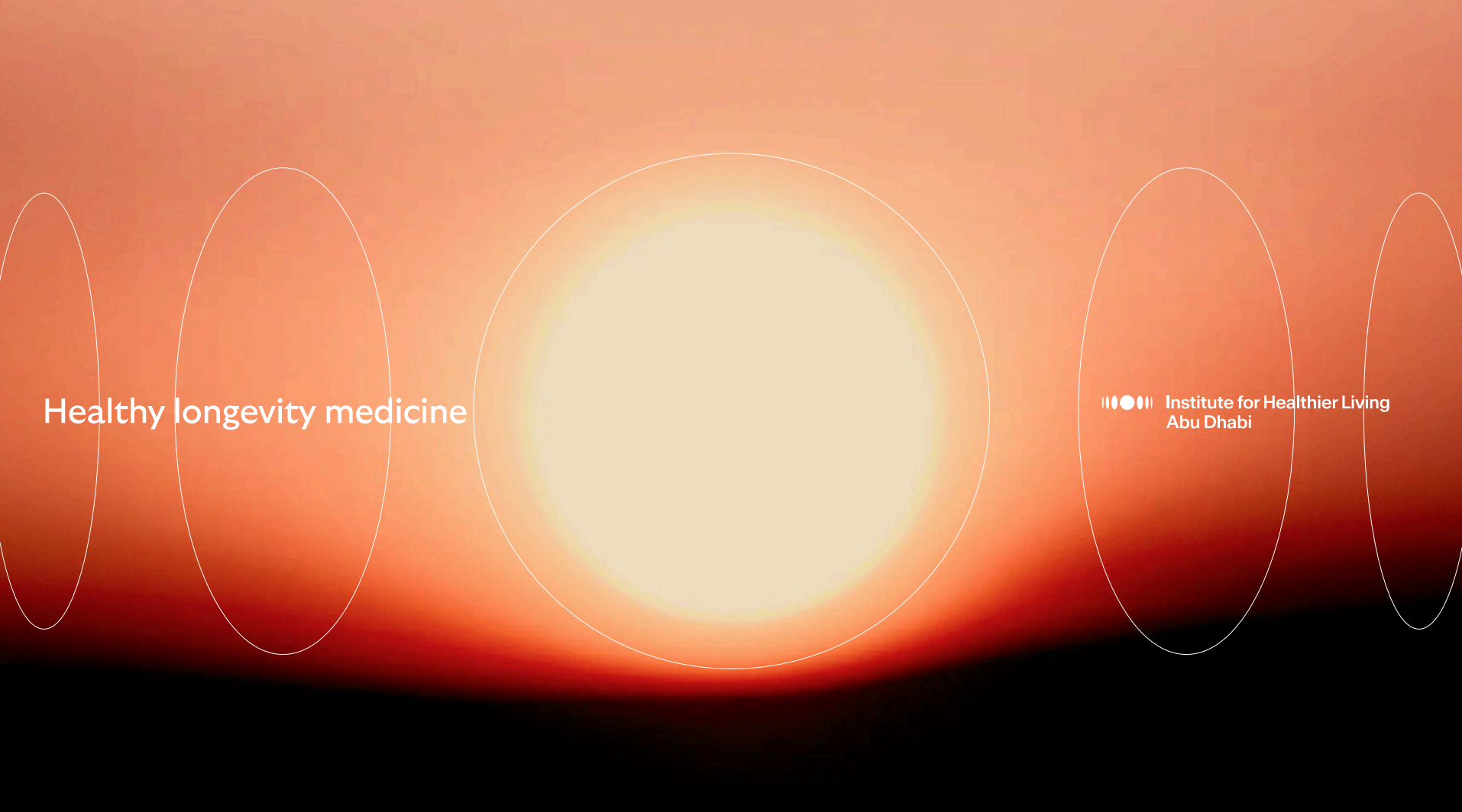
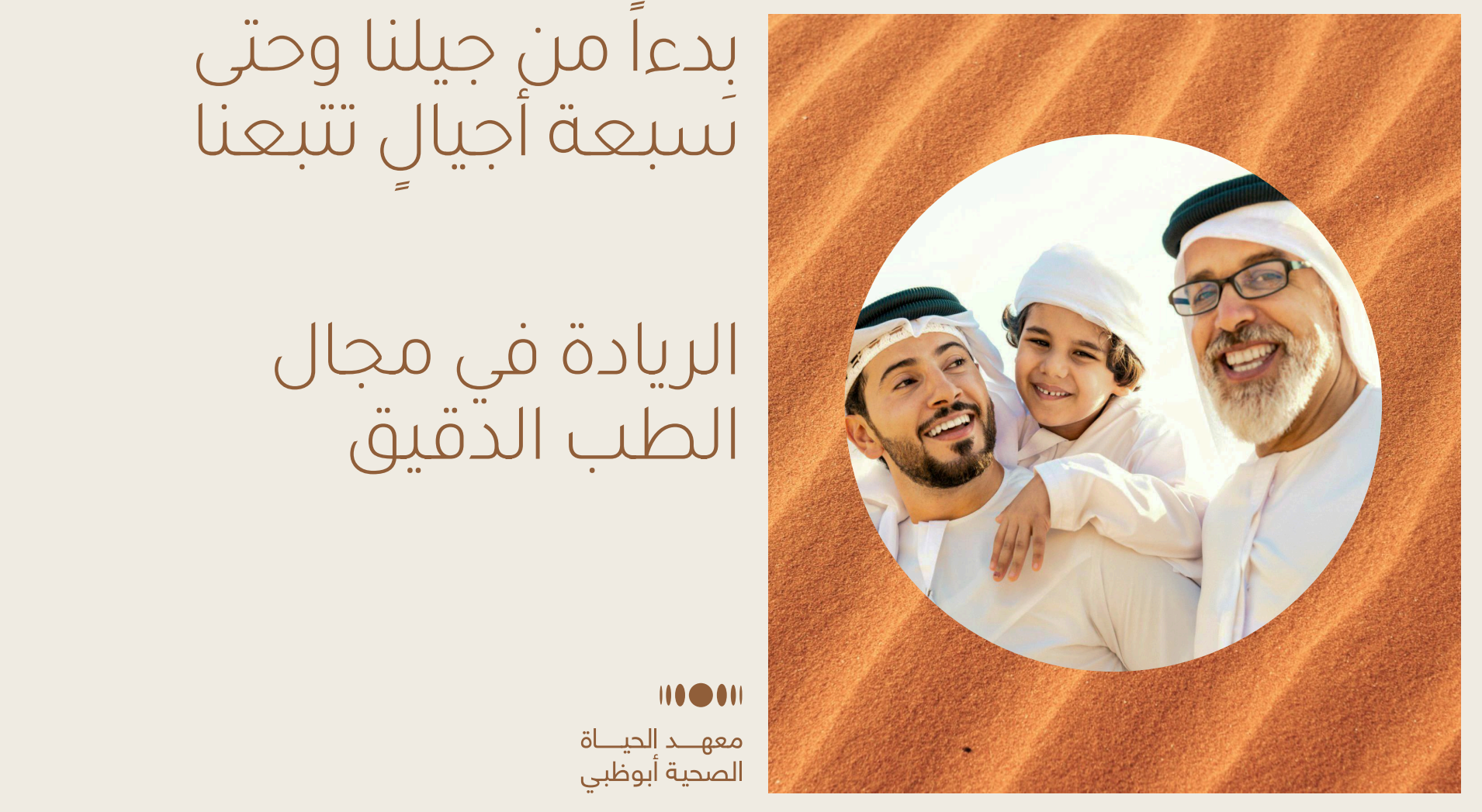
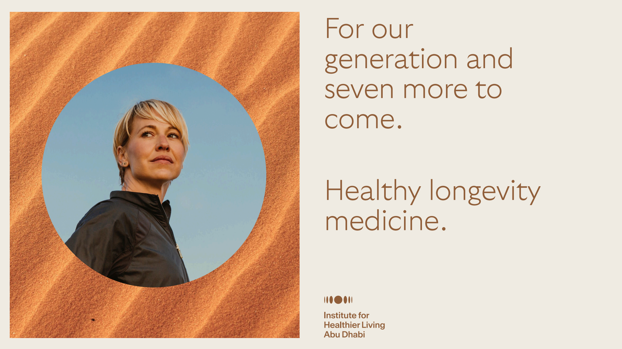
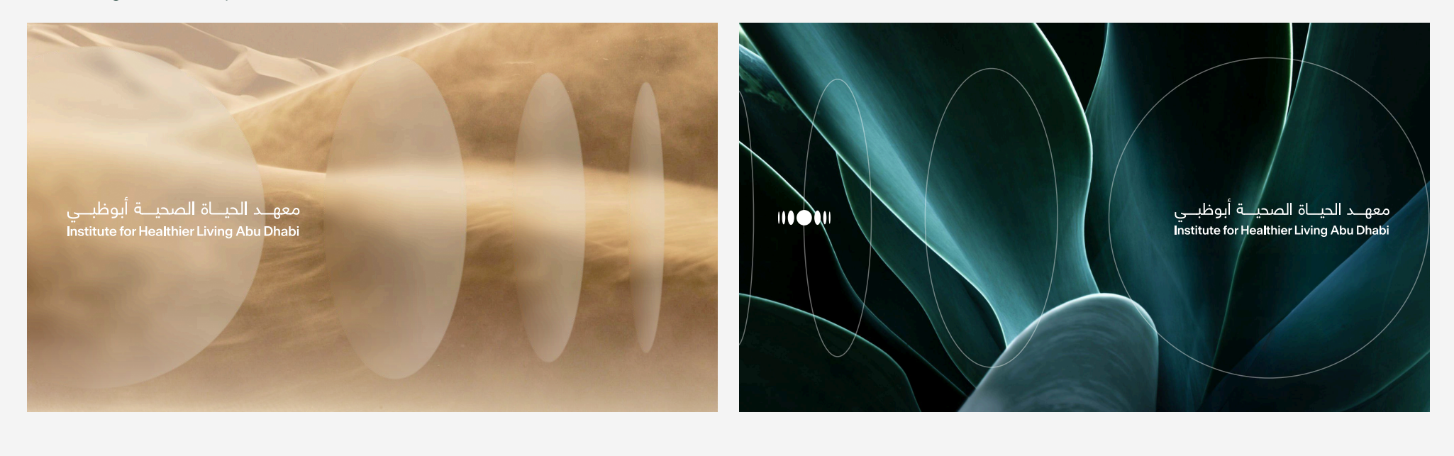
IHL's Logomark, The Prism
The Prism, which serves as
our logomark, is also the
basis for our more extensive
graphical brand system. The prism alludes to:
- The recurring and
enduring cycles of nature
and humans
- Our 360°, comprehensive
approach to our patients
health
- The pursuit of
“wholeness” in our
patients health journeys.

Minimum Sizes and Clear Spaces
The Prism will always be recognized and consistent in all applications both physical and digital.

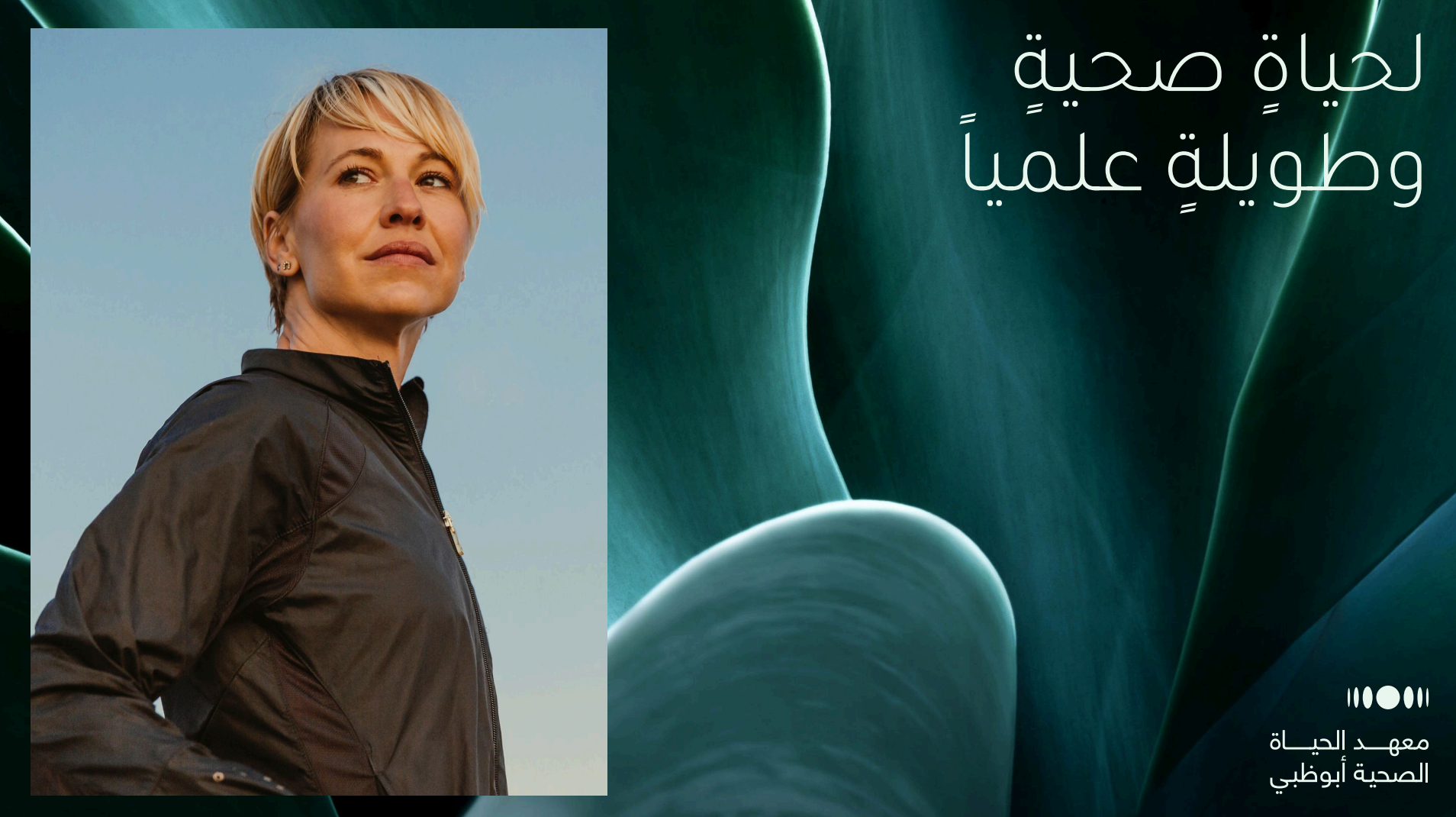
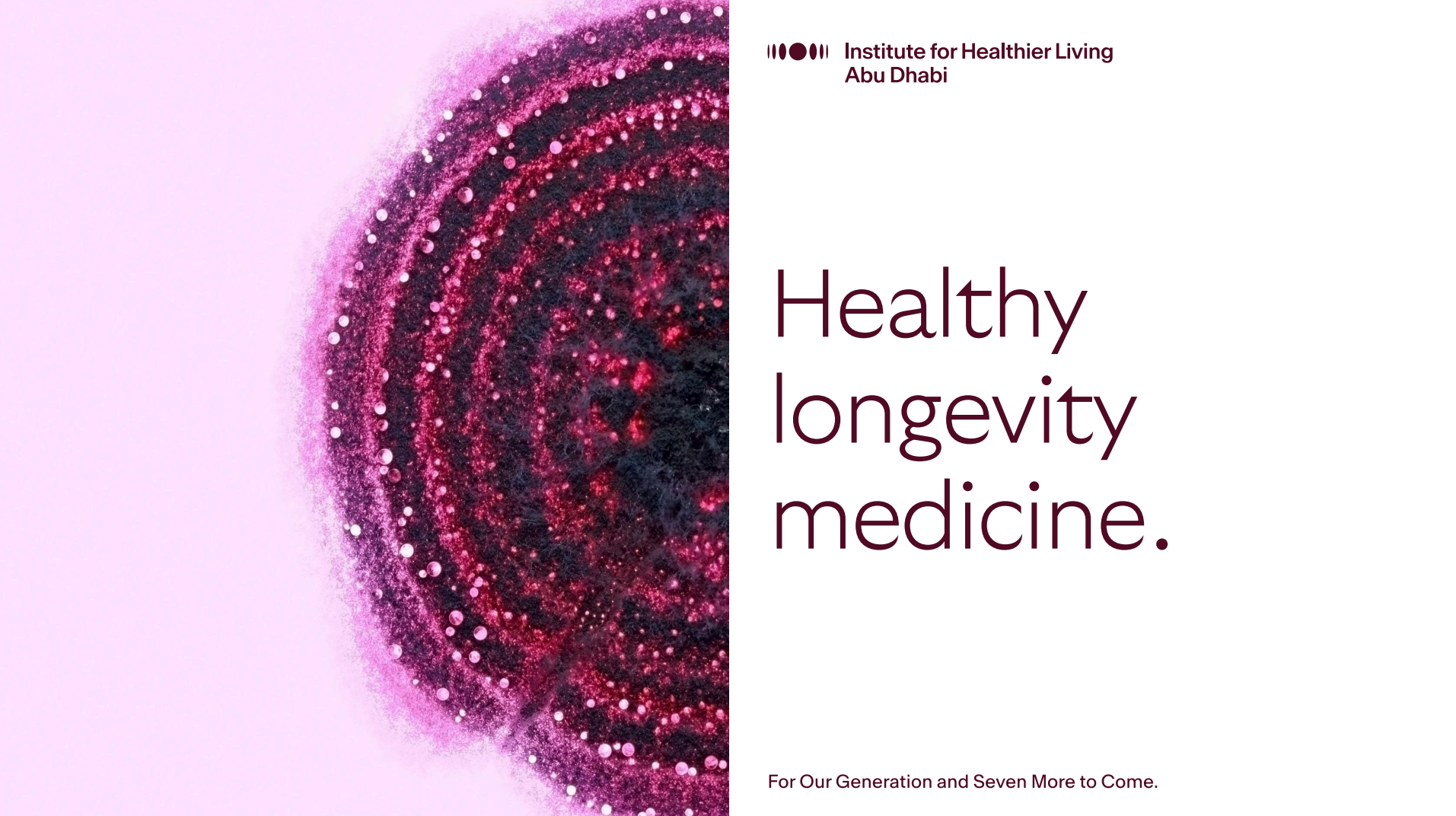
IHL's Wordmark, English
The English wordmark is set by the brand's name and the location modifier in combination of the typefaces Antarctica as the main name and GT Ultra all caps for the location modifier, providing a clean and elegant way to display our brand.
Wordmark, Scale and Clear Space
To look its best, our wordmark needs space to stand out, using the defined parameters to make sure no other elements encroach on this clear space

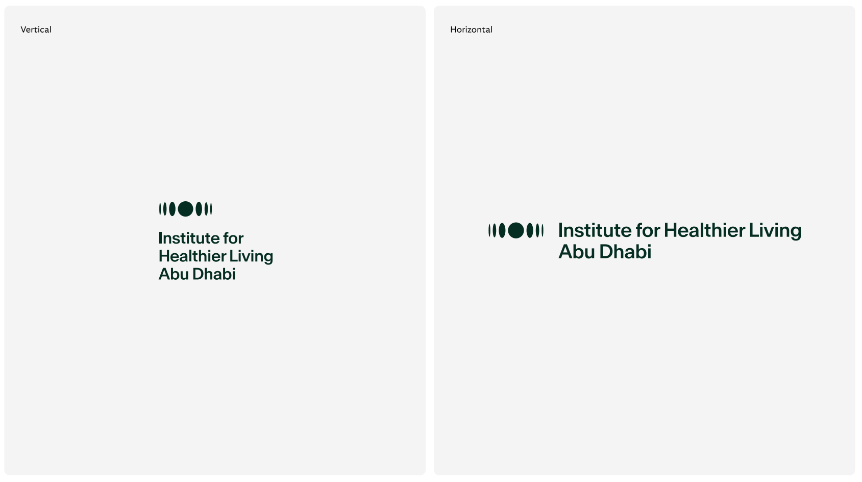
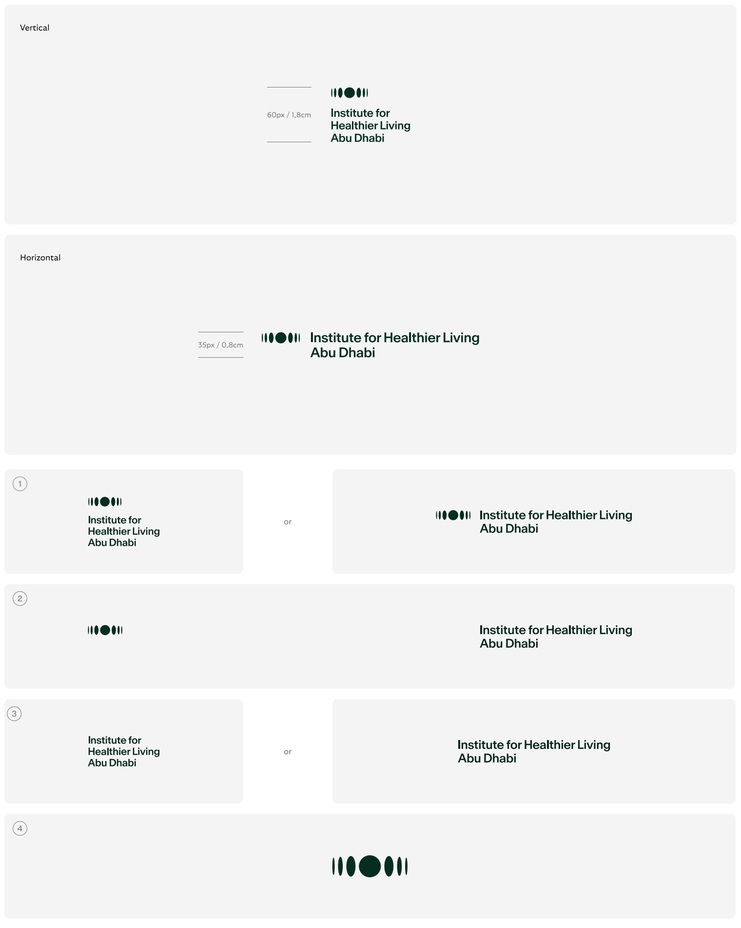
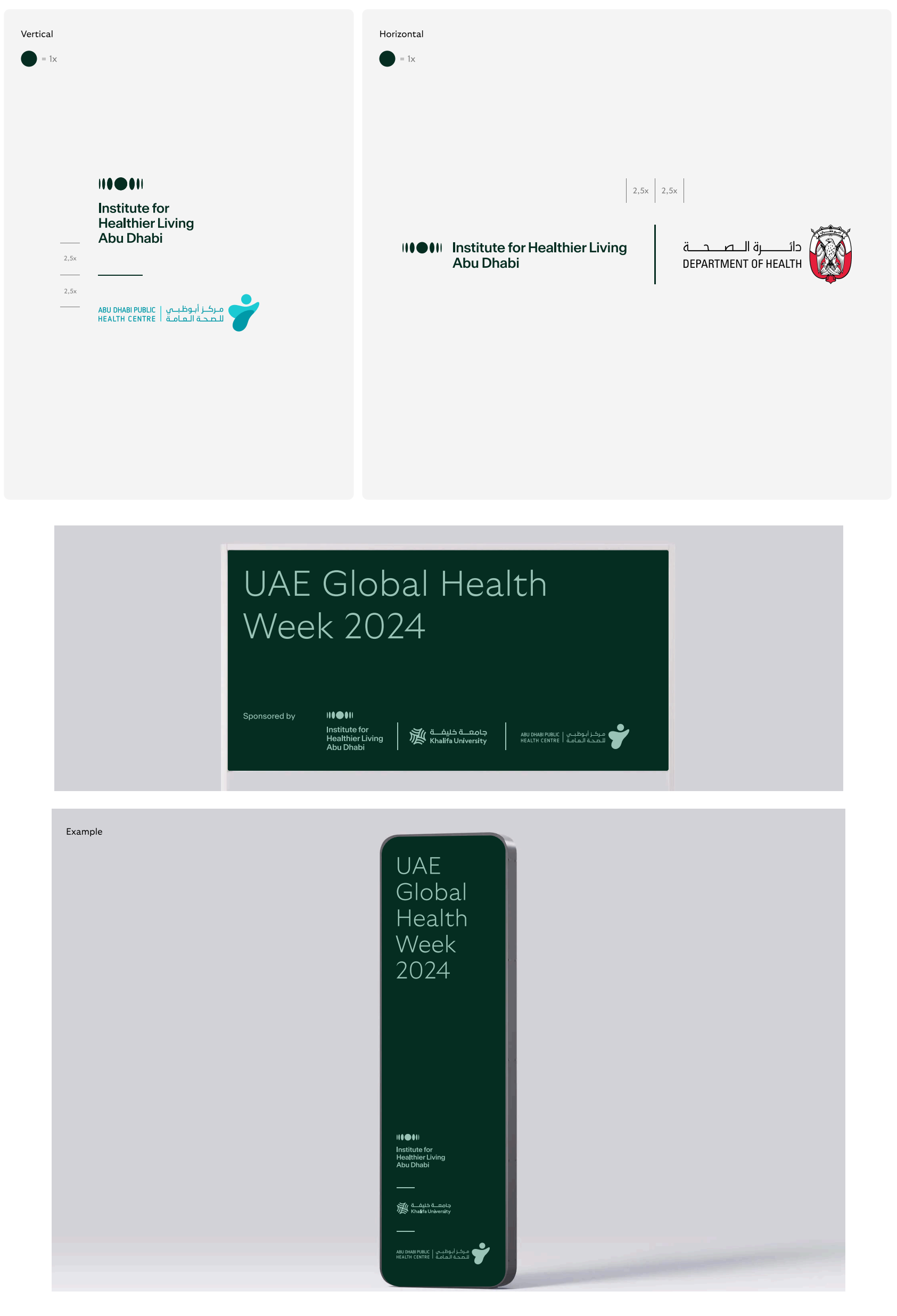
Combination Lockups
These combination lockups that can be leveraged to accommodate a wide variety of composition types
Brandmarks: Scale and Clear Space
To look its best, our brandmarks need space to stand out, using the defined parameters to make sure no other elements encroach on this clear space

Minimum Sizes & Usage Priority
For clarity across digital and print applications the brandmarks should never be reproduced at any size below this guidance
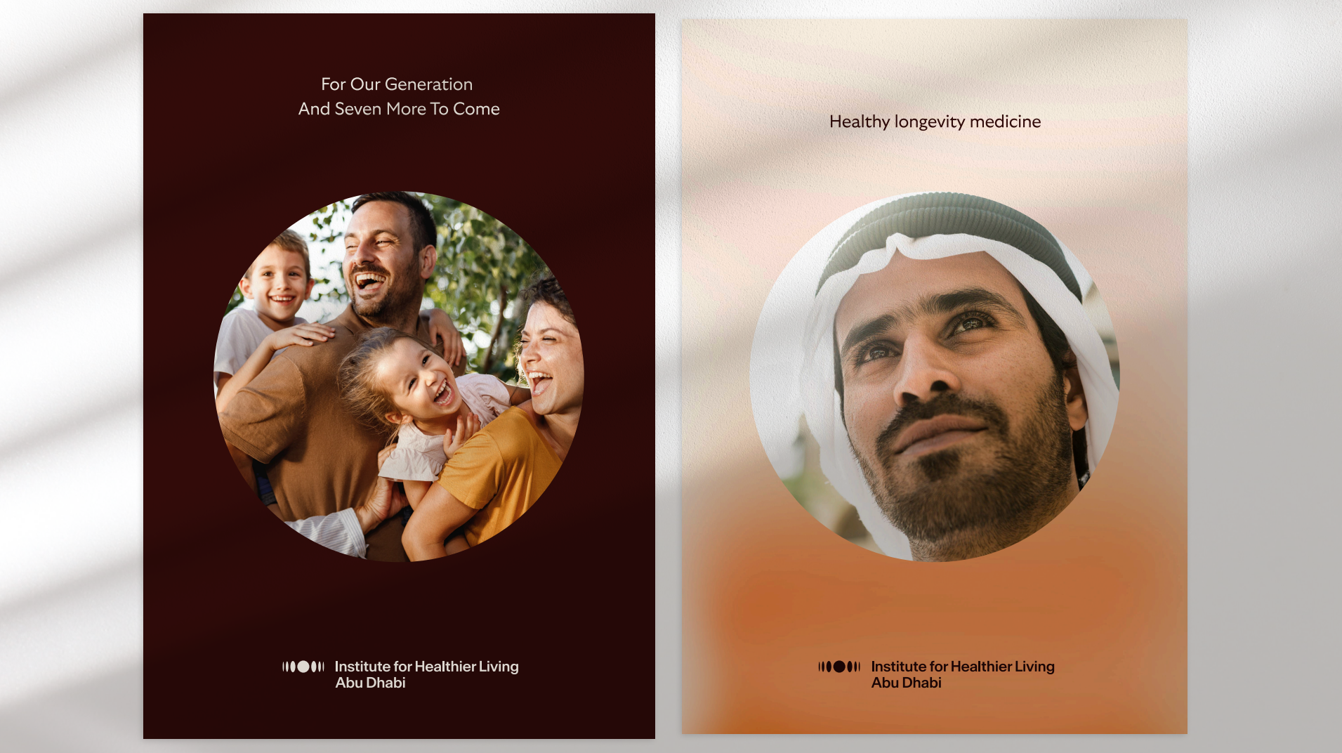
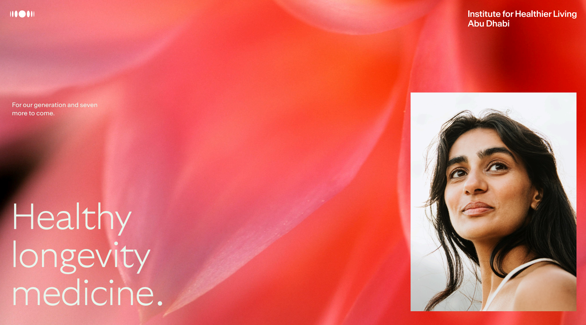
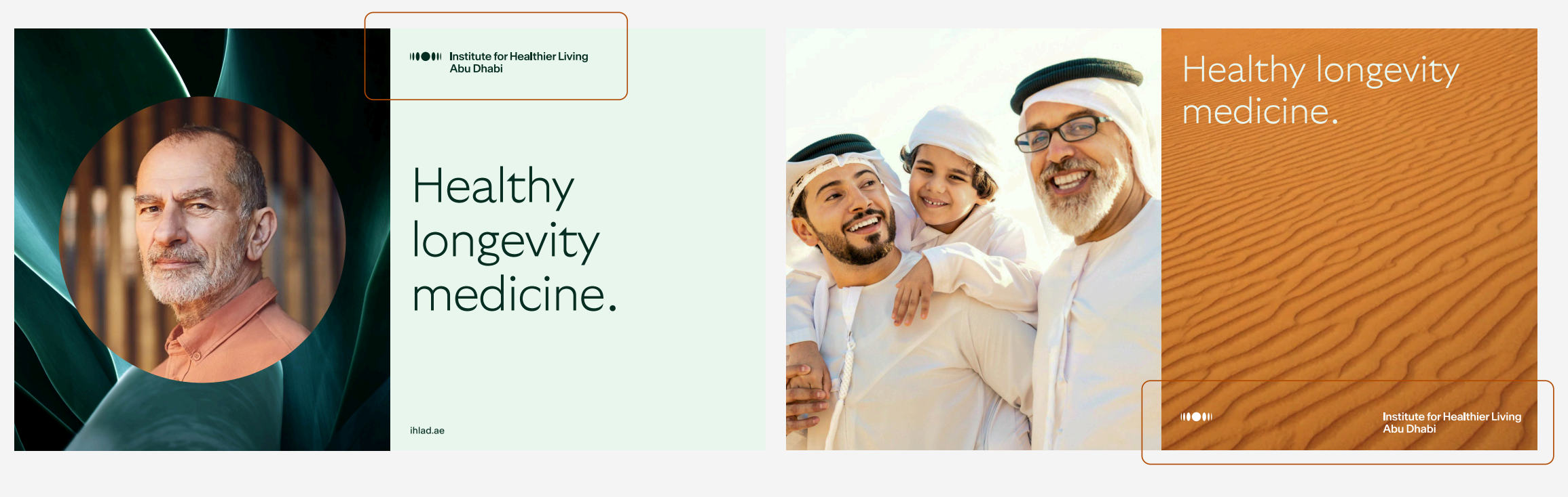
Brandmark Applications
The Prism logomark and wordmark can be uncoupled within compositions to allow more flexibility, and create more dynamic layout compositions
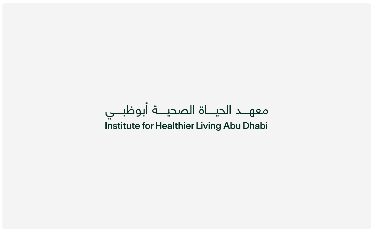
Wordmark: Bilingual
Multilingual lockup is set by the combination of both wordmarks in a balanced way providing a full comprehension of the brand for all audiences
Wordmark Scale and Clear Space with Combinations
The prism can still make an
appearance within
compositions where the
bilingual brandmark is
leveraged.
Proper spacing allows the
mark to breath and remain
highly legible
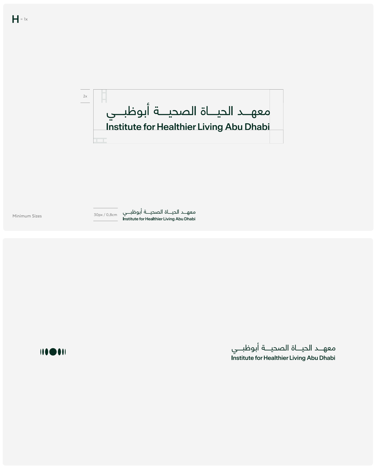
Brandmark Applications
The Latin + Arabic wordmark can be used both locked up with the logomark and separated
Co-branding
Each brands mark is unique in shape and visual weight. Always using the best judgment when scaling each brand
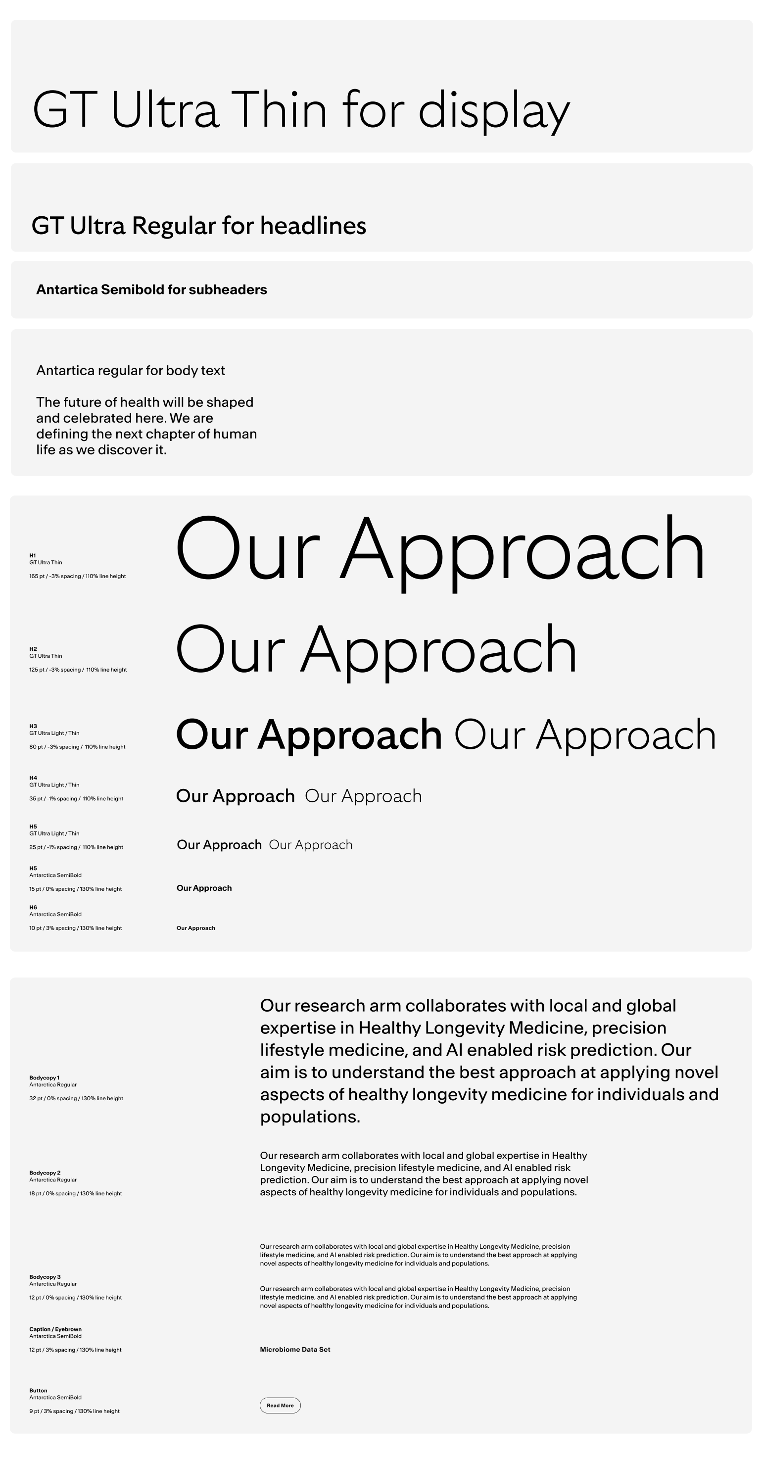
Typography: English
Primary typeface for
English is It dances
between the worlds of sans
and serifs: Fusing the artful
details of Arabic calligraphy
with rational, modern
construction. Creating a
highly functional, yet beautiful
type family that challenges
contemporary typographic
expectations
Supporting typeface for
English is , a sansserif typeface that lives in
simplicity, minimalism, and
purity. It brings precision and
clarity to our message at
small sizes, and pairs
seamlessly with GT Ultra
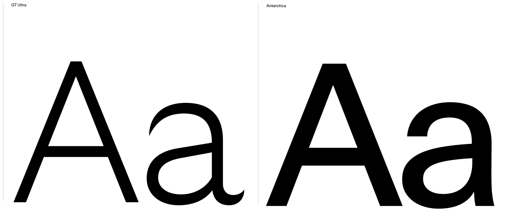
Hierarchy, Proportion & Styles
Understanding how to leverage our brand typefaces and weights at various scales to ensure legibility and consistency
Typography: Arabic
Primary typeface for Arabic is Tajawal
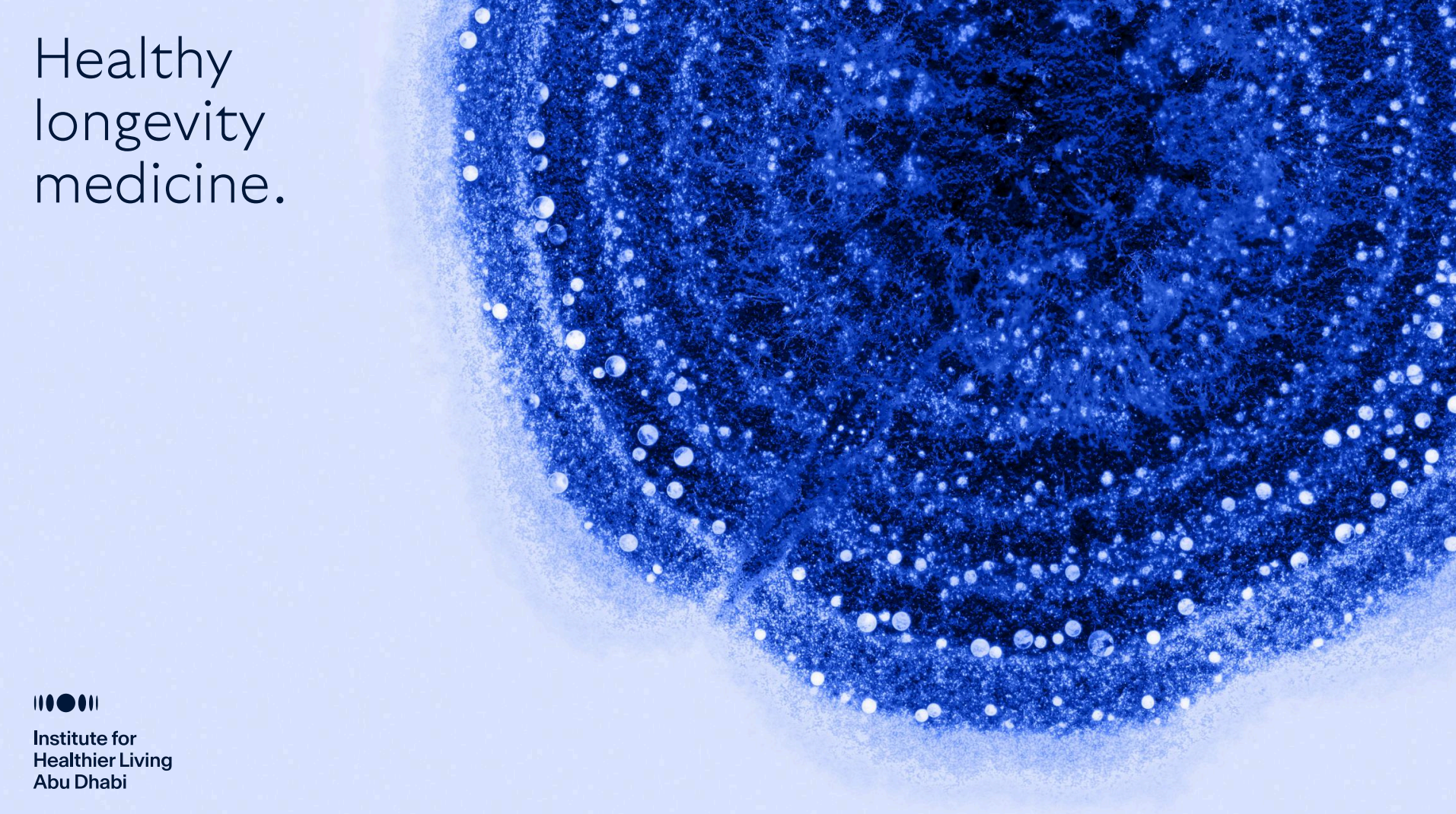
Color
The color palette was
inspired by the natural
environment of Abu Dhabi
and the greater UAE
Pulling colors from the local
environment helps us to
reinforce a brand born out of
the UAE—tying it to local
context and culture.
Color Palette Variations
The full palette balances natural, warm earth tones with bright, vibrant modern colors. Creating a sophisticated and welcoming color palette that speaks successfully to both our clinical innovation and our best-in-class, personalized clinical care
The Prism
Expression & Promotion
Brand Collaterals