Reya Healthcare
Identity | Branding | Outreach
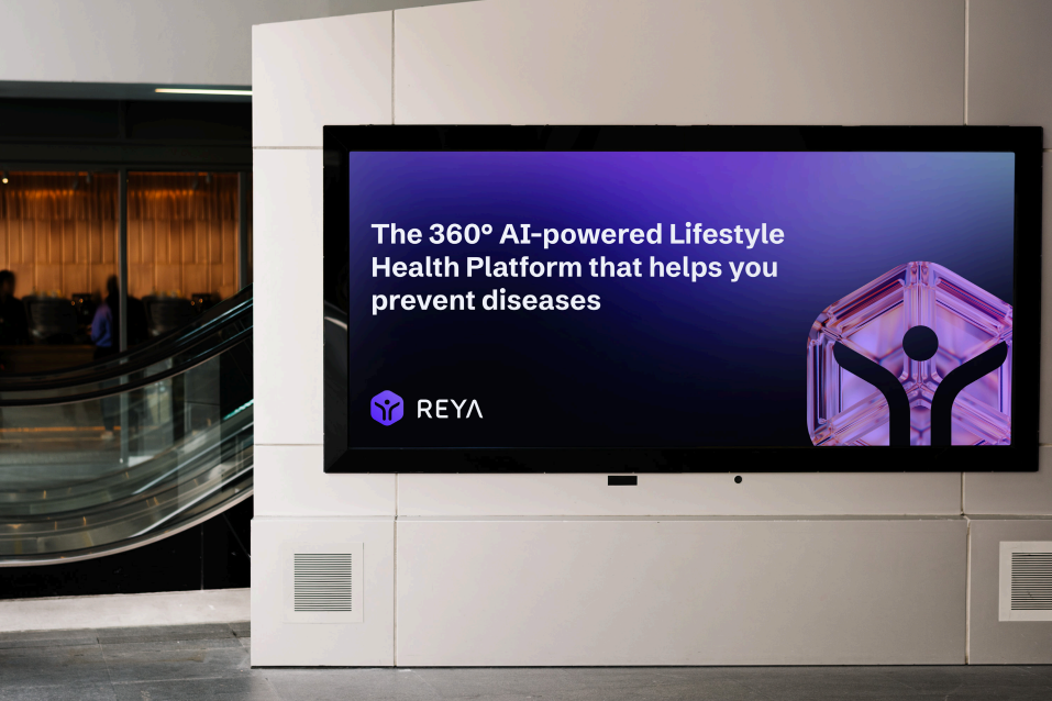
The Mission
Reya's log merges modern design with symbolic meaning to embidy the brand's mission & vision

My Role
My role was to solely handle all the company's UX and Visual design aspects, from UI, personlaized typography, tehinical/ medical illustrations to developing the complete brand identity.
I was incharge of creating & maintaining a systemic library of our product's assets & components. A vital part of my role was collaborating with developers closely to deliver requirements, documentation, & design specifications
Improving Lifestyles
The Reya logo visually represents the brand's commitment to revolutionizing personal health management through advanced, supportive, & personalized AI technologies
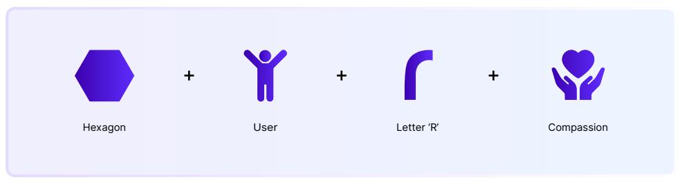
Elevating Wellness
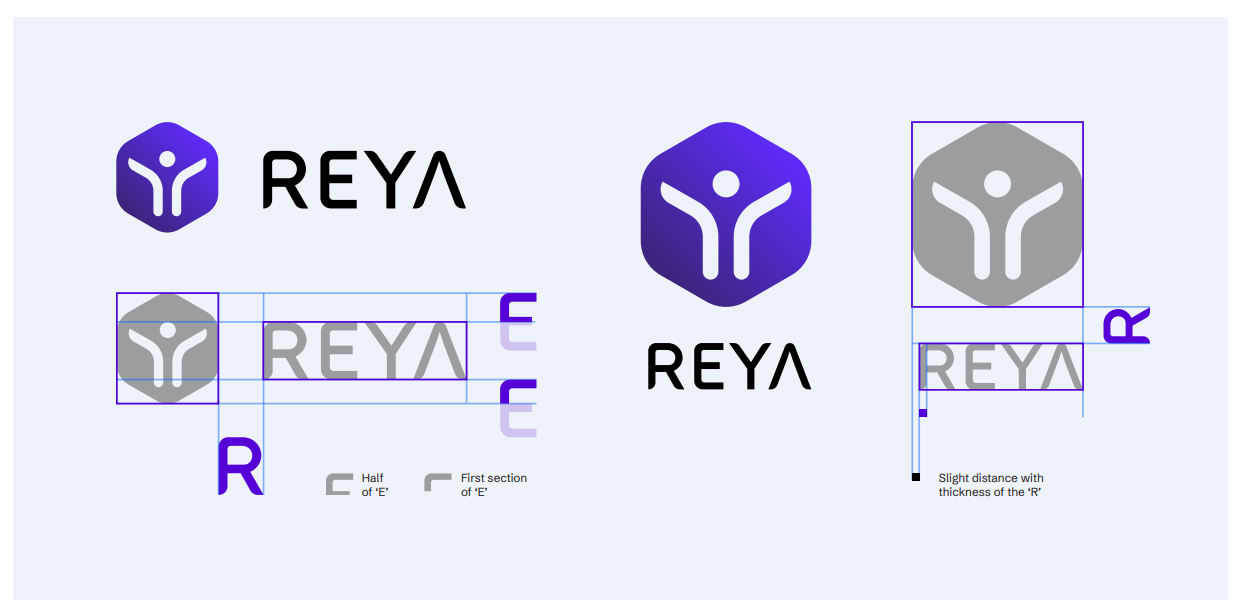
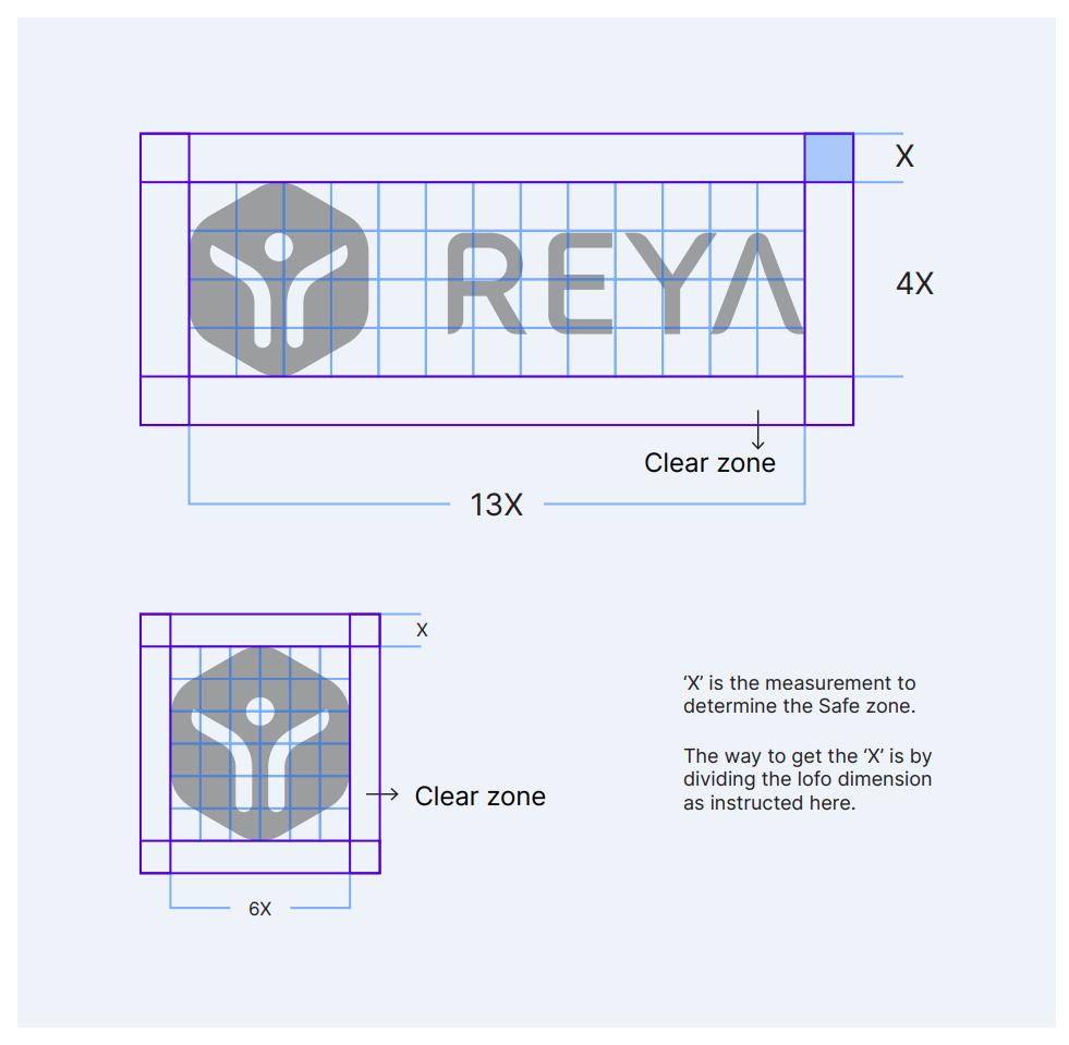
Brandmark Construction
Safe Zone
A safe zone is a required amount of space tht needs to exisit around the logo or symbols in order to ensure legibility
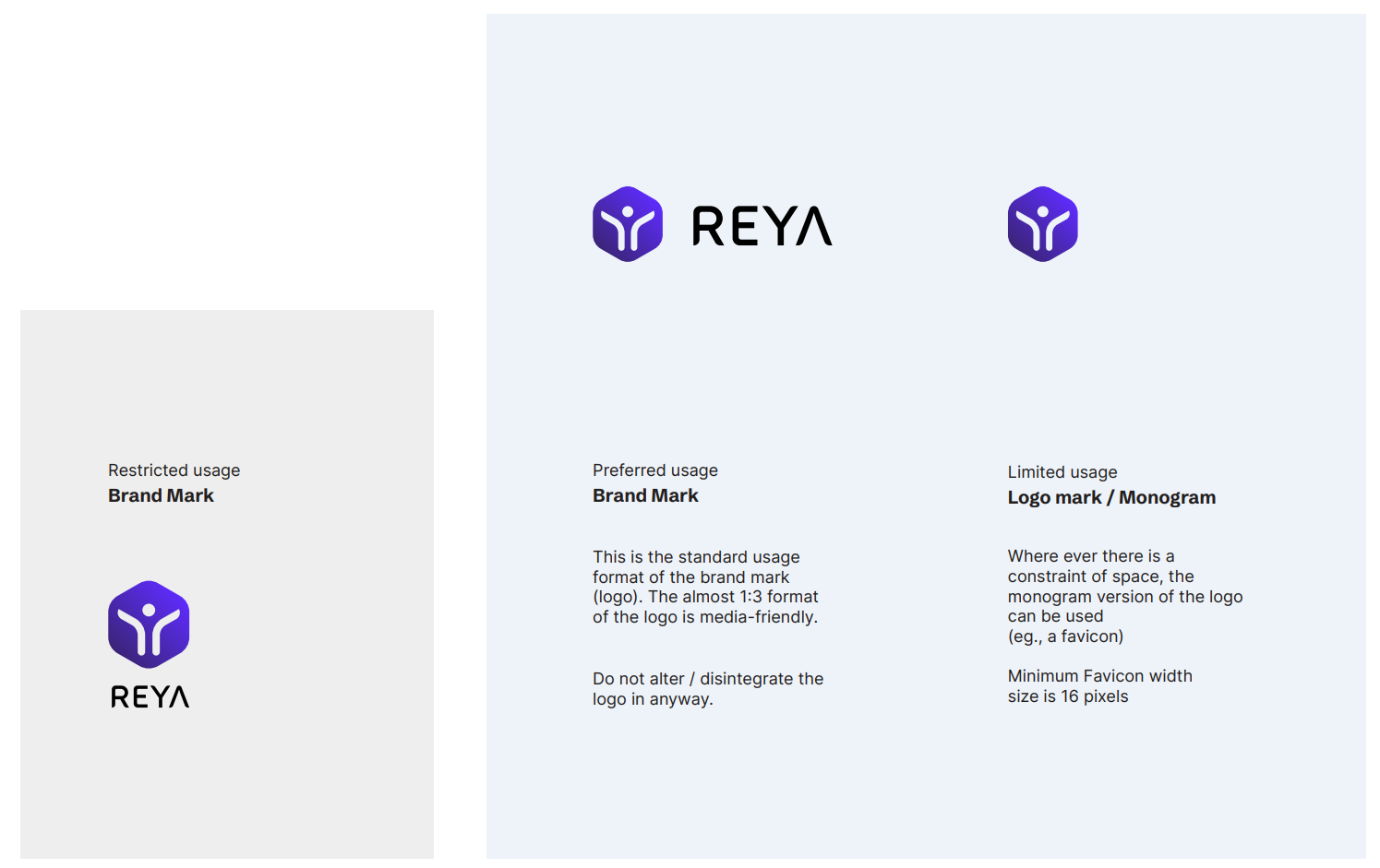
Logo Usage
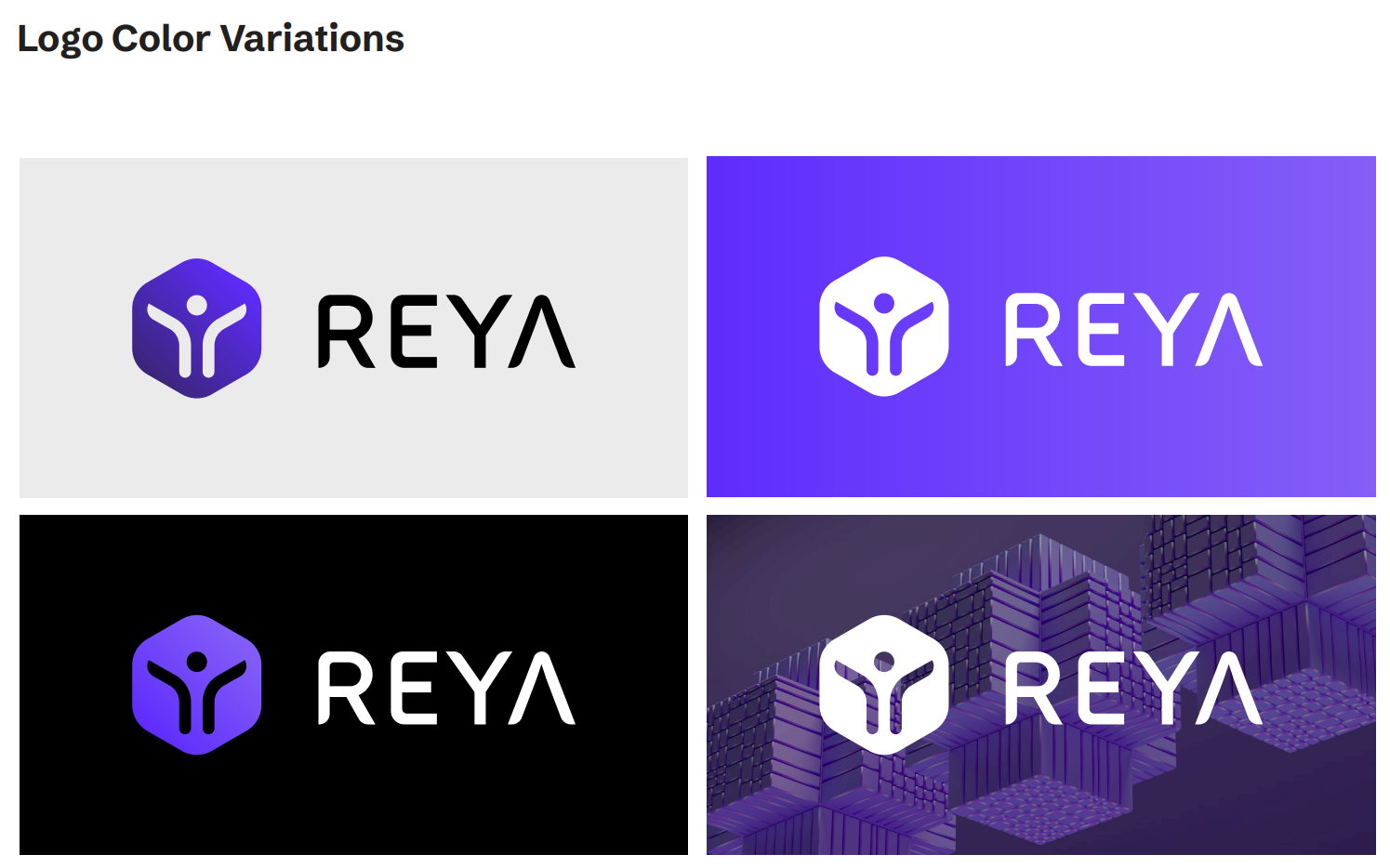
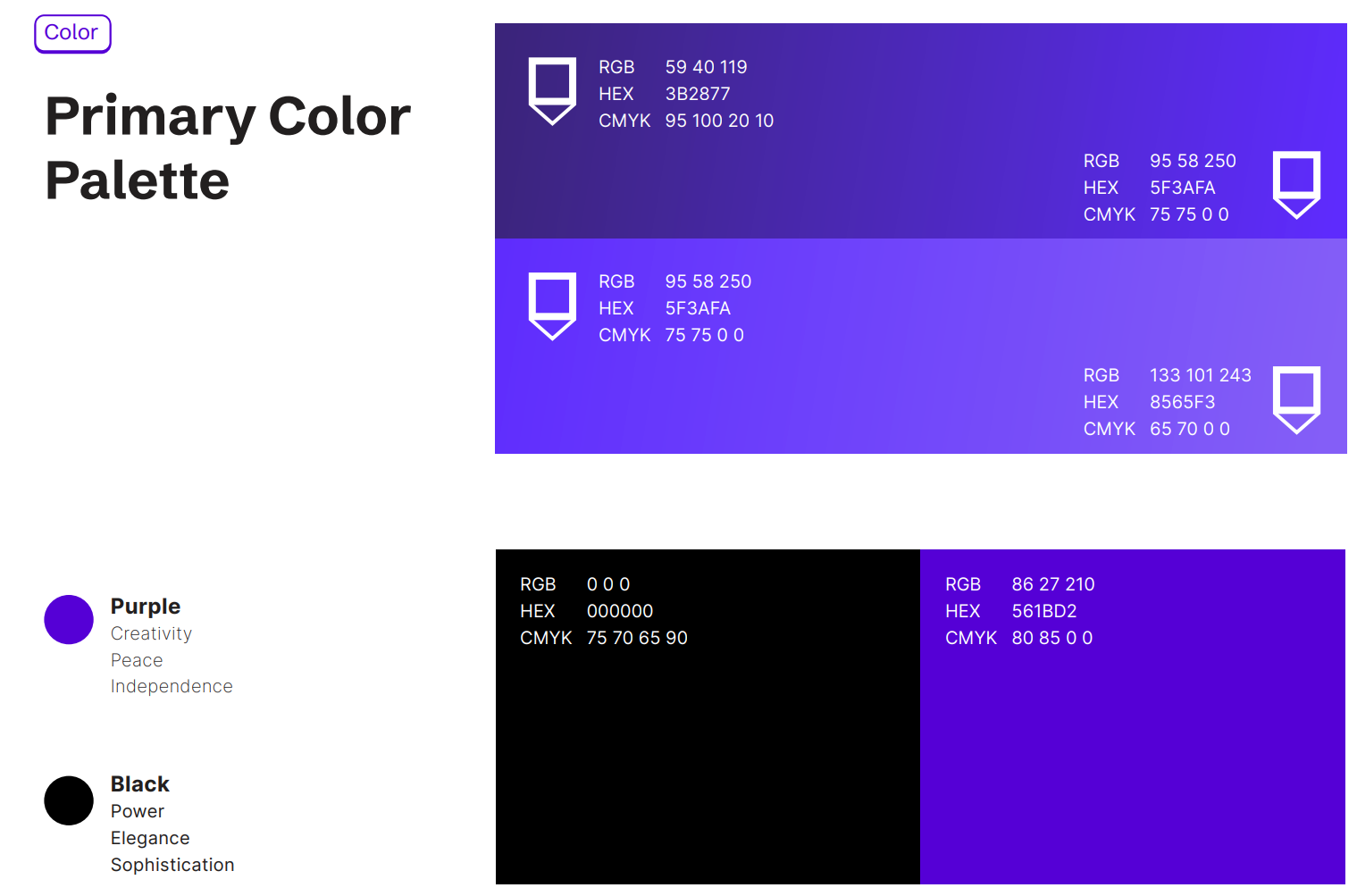
Colors
Tints further extenr the color palette. Tints are often used as a background for text heavy pages
All tints are delivered from the rpimary palette. Only those percentages of tints given from 15% to 75% are allowed


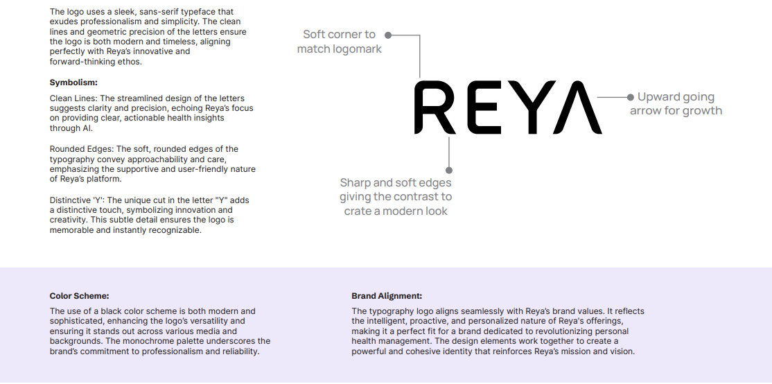
Typography

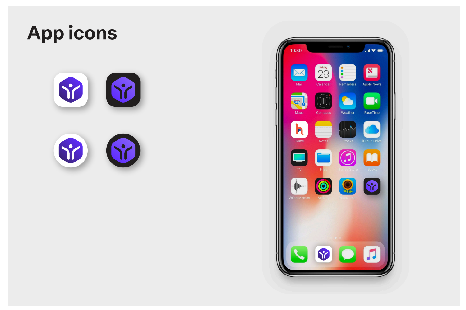
Graphic Elements

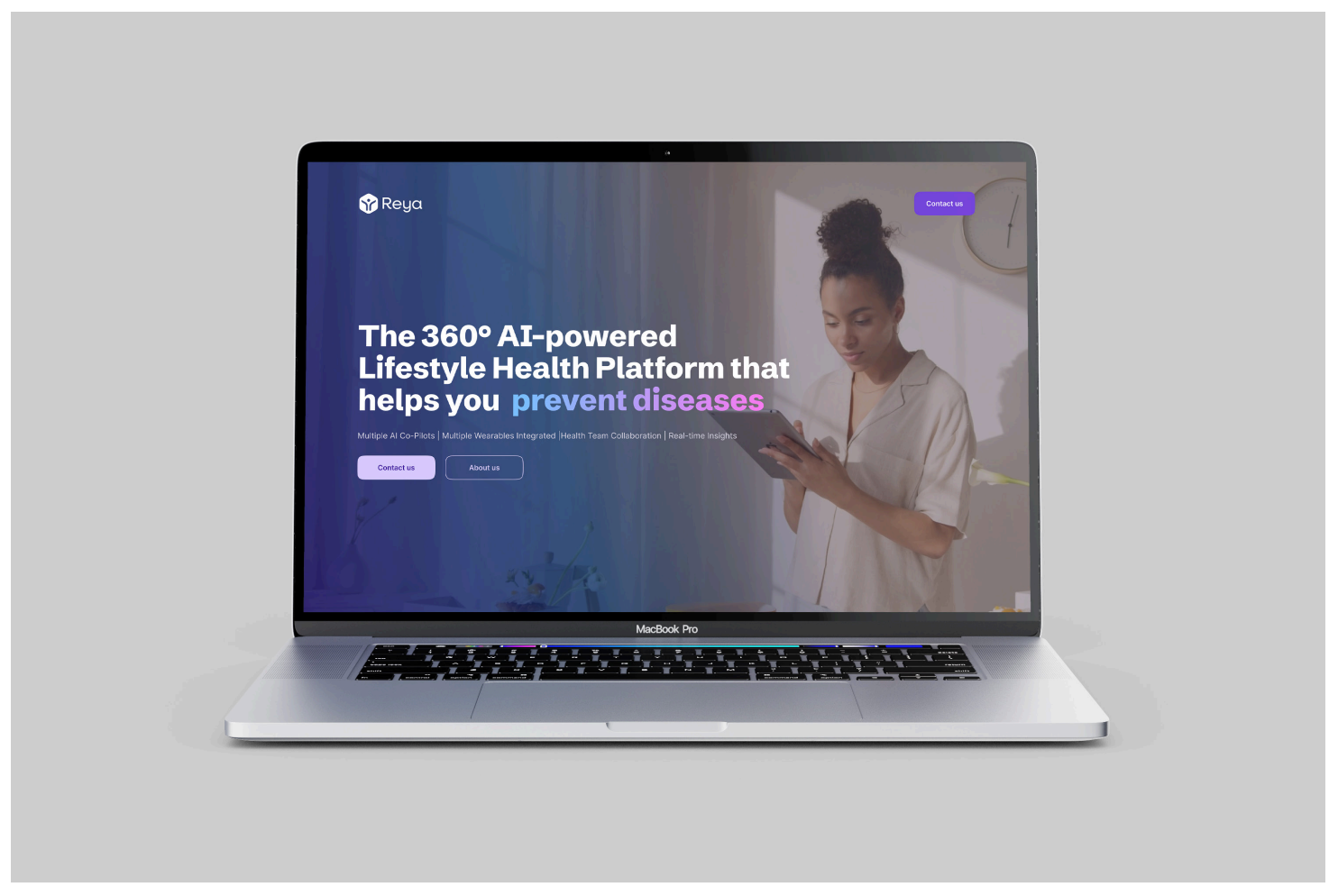
Brand Collaterals


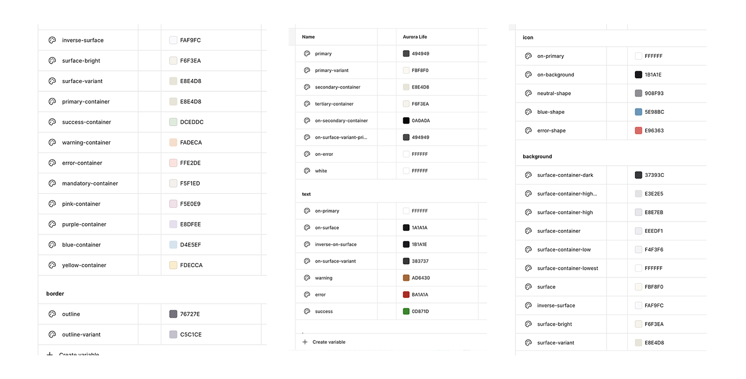
Application Theming: Light Mode

Application Theming: Dark Mode


Color token to change mode
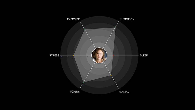
Patient Northstar explorations

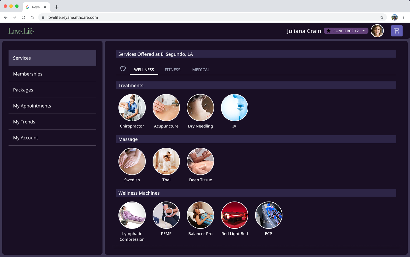
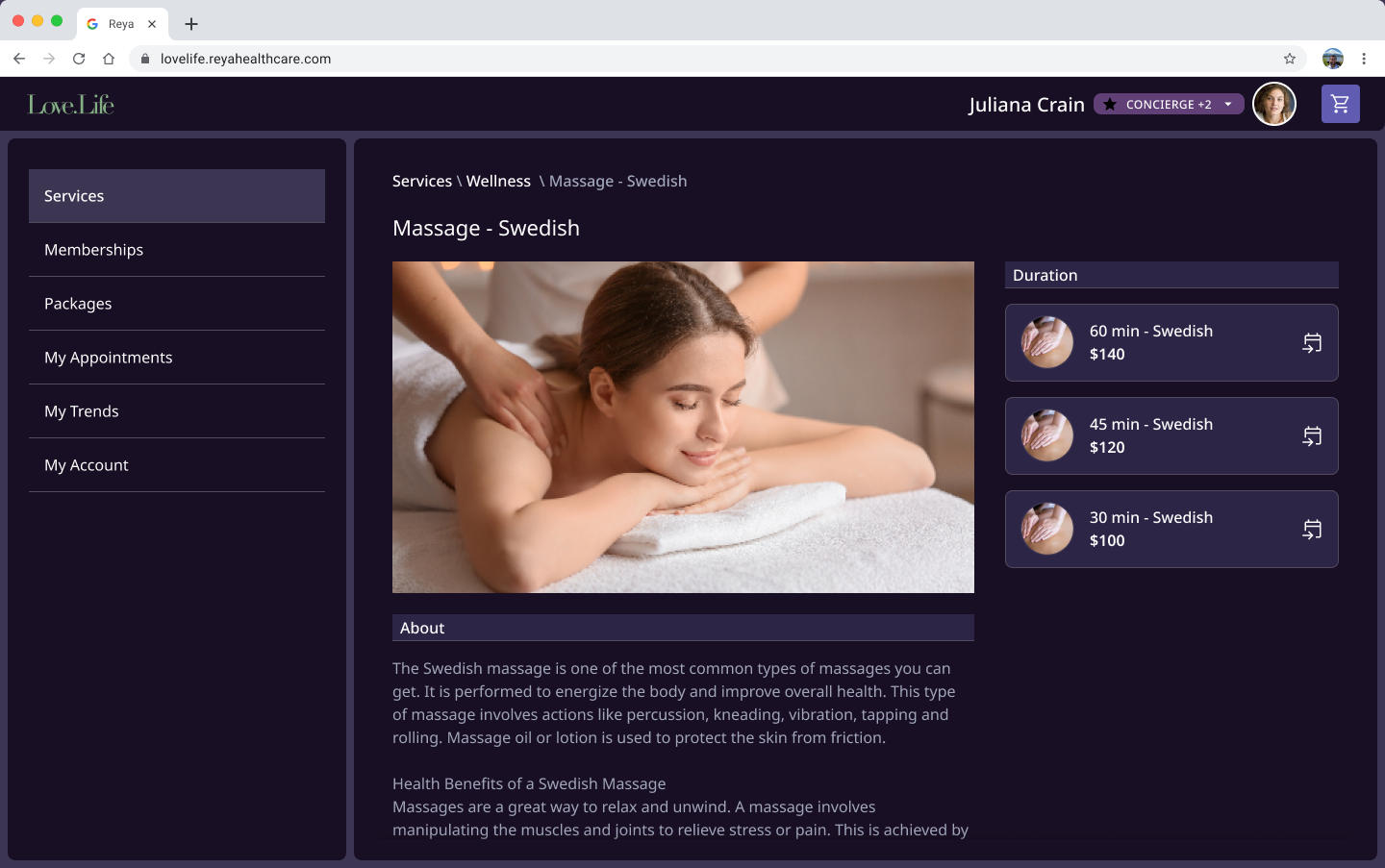
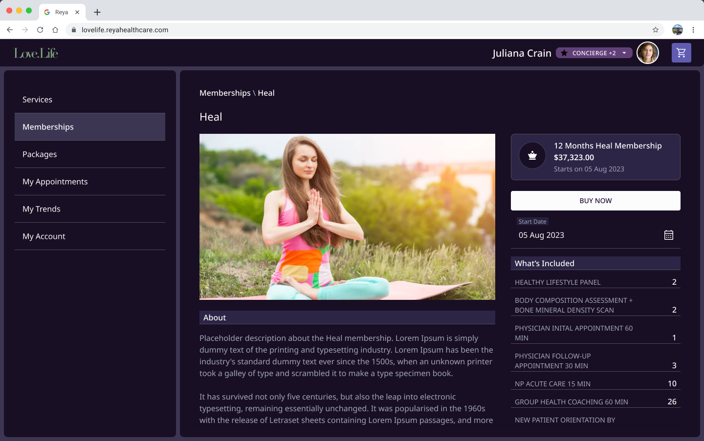
Application Theming: Dark Mode